Color
Coupled with the layout system, the Vevo color palette supports and complements a diverse range of artist content. A considered system of secondary tones adds depth and hierarchy. Together with the core palette, it forms a key part of the Vevo identity.
Core Palette
Our core palette is inspired by the multitude of tones found across the videos on Vevo’s platforms. Warm, cool and neutral colors combine to create a flexible palette that is able to react to the full range of artist content.
Below are the approved color values for each color in the palette. Always use the correct color mode and ink formulation for the appropriate application type, to ensure color consistency across all mediums.
Core Palette
Type
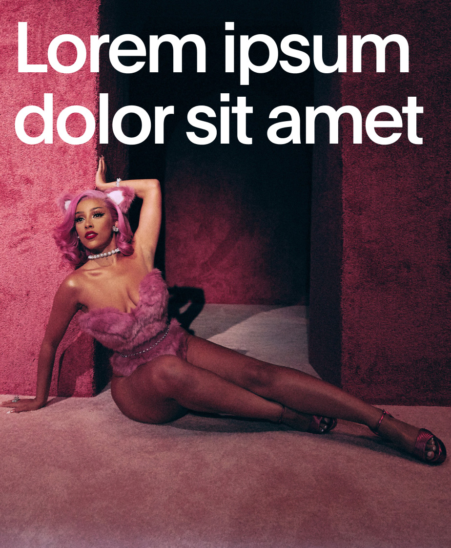
Below are the different color combinations when combining our core palette with typography. Adhering to these combinations will ensure consistency across all formats.


Core Palette
Logo
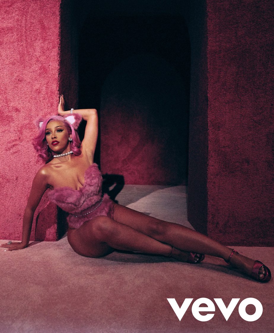
Below are the different color combinations when combining our core palette with the Vevo logo. Adhering to these combinations will ensure consistency across all formats.


Core Palette
Black and White
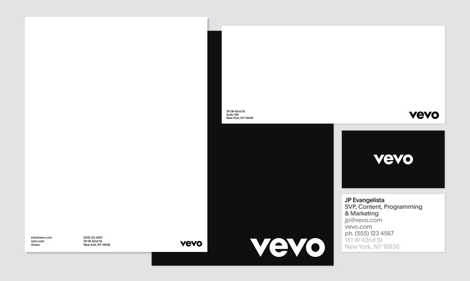
When color is not needed, or for more specific use cases such as printed documents, both the logo and typography also combine with black and white.


Core Palette
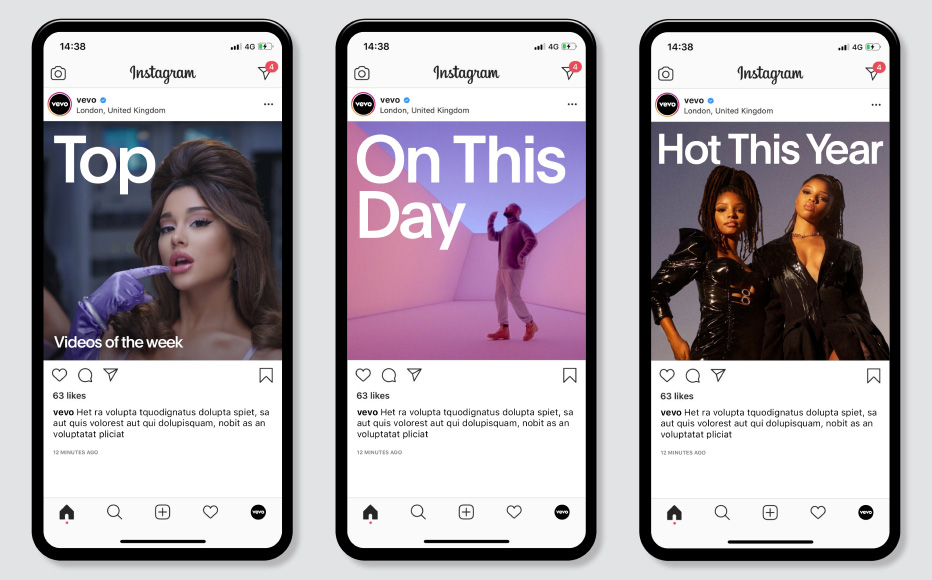
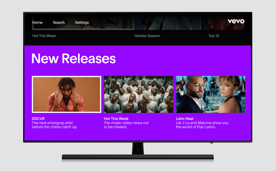
Application Examples


Core Palette
Don’ts
In order to enstablish a sense of consistency and recognizability across the visual identity, there are certain things that should be avoided when using the core palette.
 1. Do not use any opacity below 100% for background color.
  2. Do not combine colors.
 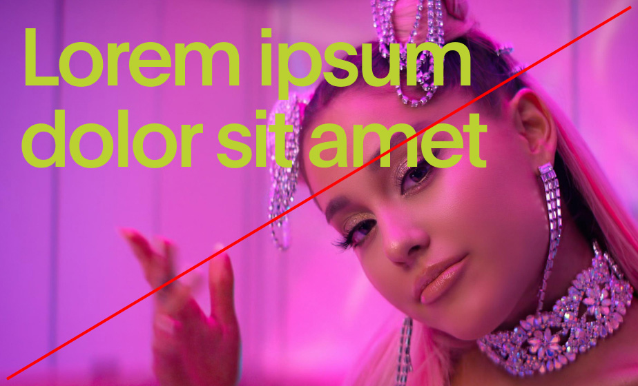 3. Do not use color typography over imagery.
 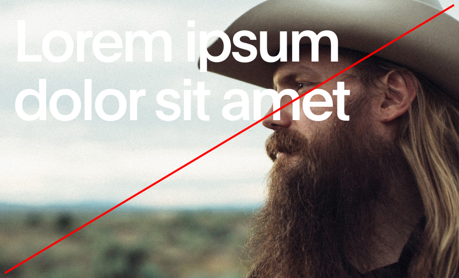 4. Do not place typography or logo on images that don’t create enough contrast for legibility.