Color
Secondary tones are an intrinsic part of the Vevo identity. They speak to the ideas of depth and amplification, but also act as an important tool for creating hierarchy within compositions. There are two methods for creating secondary tones: opacity reduction and tint reduction.
Secondary Tones
Secondary tones are an intrinsic part of the Vevo identity. They speak to the ideas of depth and amplification, but also act as an important tool for creating hierarchy within compositions. There are two methods for creating secondary tones: opacity reduction and tint reduction.
Secondary Tones
Guidance
When using our secondary tones, it is important to create consistent visual contrast between each element as they increase in tint or opacity. The Vevo brand uses increments of 25 as a starting point to achieve this.

Examples
 Clear contrast between all four lines.
  The two middle lines are too close in opacity.
 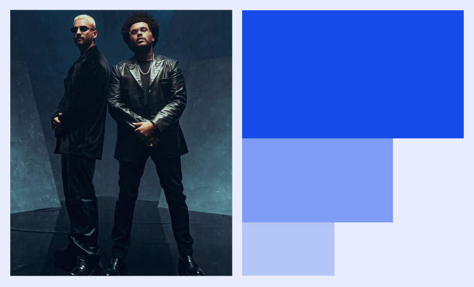 Clear contrast between all three blocks.
 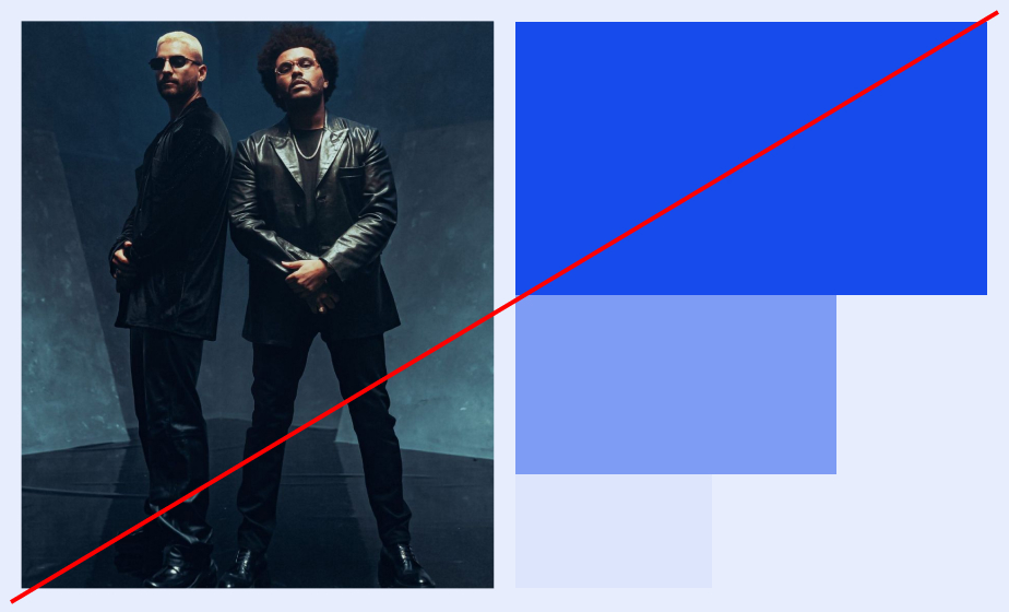 The lightest block is too similar to the background.
 Secondary Tones
Number of Elements
In order to ensure the right level of contrast between colors, the intensity of the secondary tones will vary based on how many elements are in the composition. This section outlines some general rules for selecting tone intensity.
Secondary Tones
Color Contrast
It is important that information using the secondary tones can be clearly read and understood. As a rule, try to avoid using lower opacities or tints for product design or any other format where a type size of less than 22px is needed.

Secondary Tones
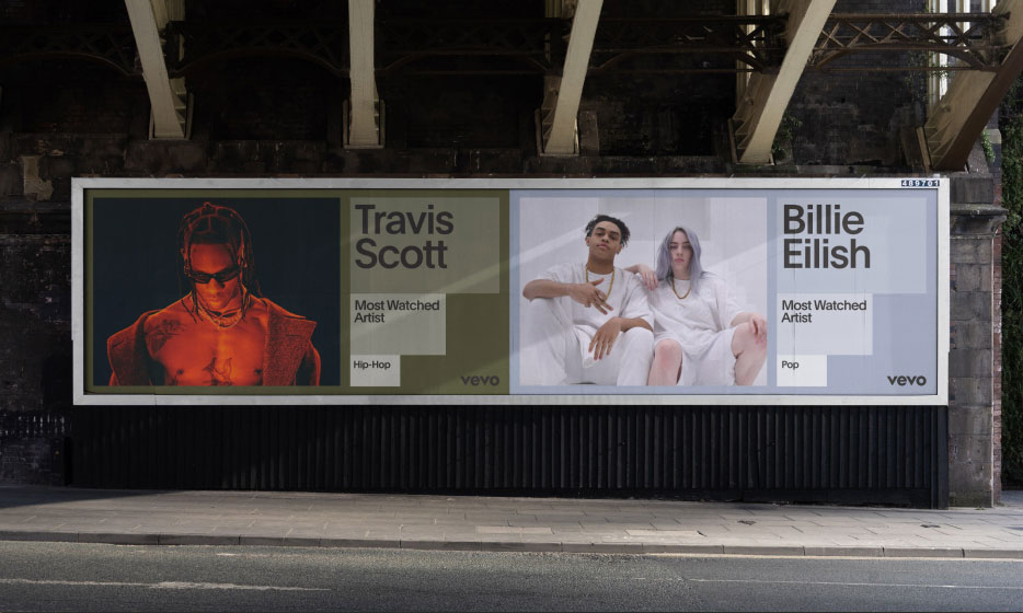
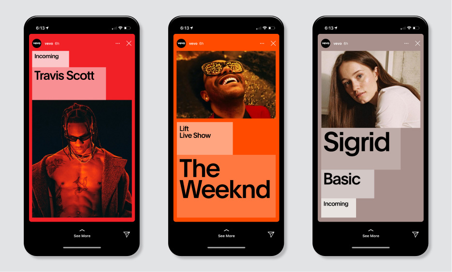
Application Examples


Secondary Tones
Don’ts
Below are some examples of things to avoid when using the secondary tones.
 1. Do not use 25, 50 or 75% as background.
  3. Do not change the order of hierarchy in still compositions.
N.B. Instances like this can be seen in motion transitions.
3. Do not change the order of hierarchy in still compositions.
N.B. Instances like this can be seen in motion transitions. 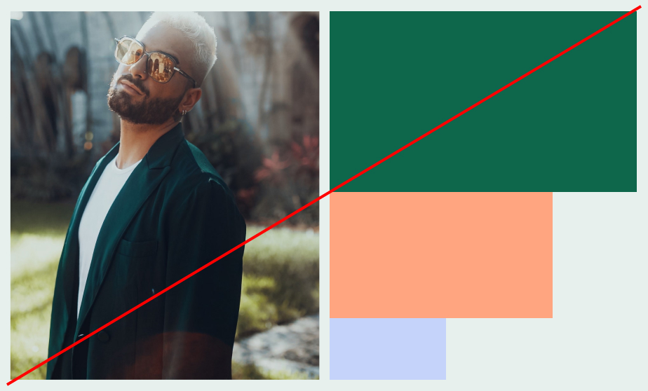 2. Do not combine colors.
  4. Do not overlay color typography on imagery.