Layout
The layout system takes artists as focal points, building dynamic compositions that frame and champion an ever-expanding roster of premium content. A modular, graphic block system offers both flexibility and cohesion.


Overview
There are two ways to create layouts using the new visual system. By using typography and imagery, or using our graphic blocks. Together, they create a range of expressions that move from simple type-led moments to more energetic compositions.
 1. Type only
 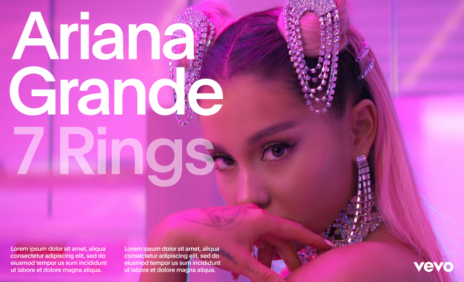 2. Type on full-bleed imagery
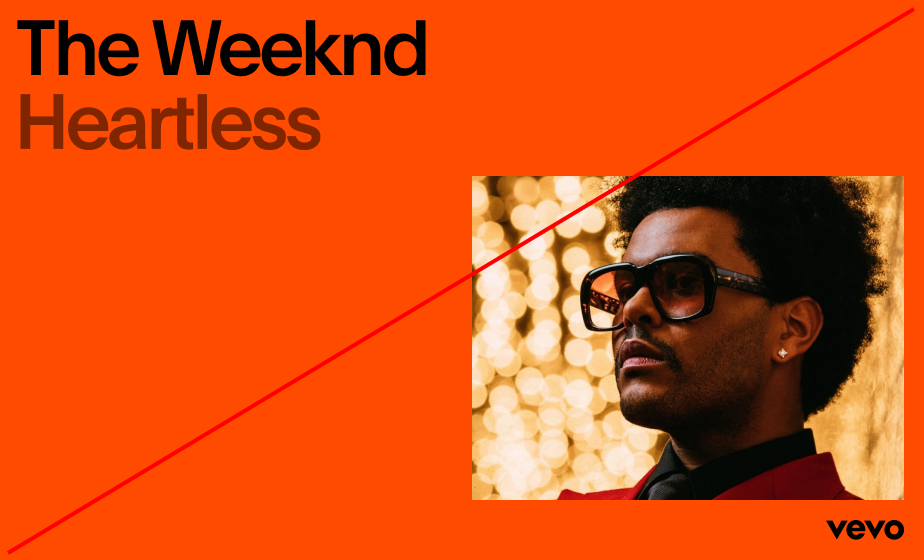
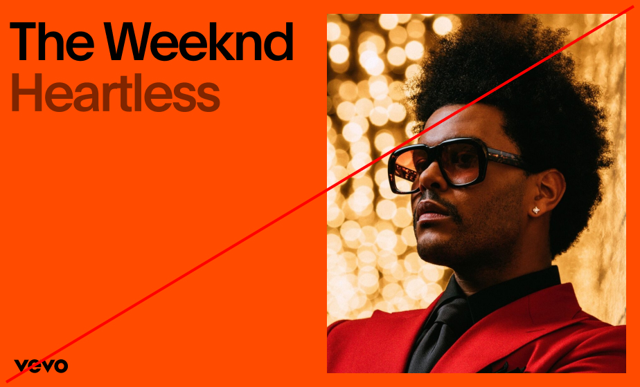
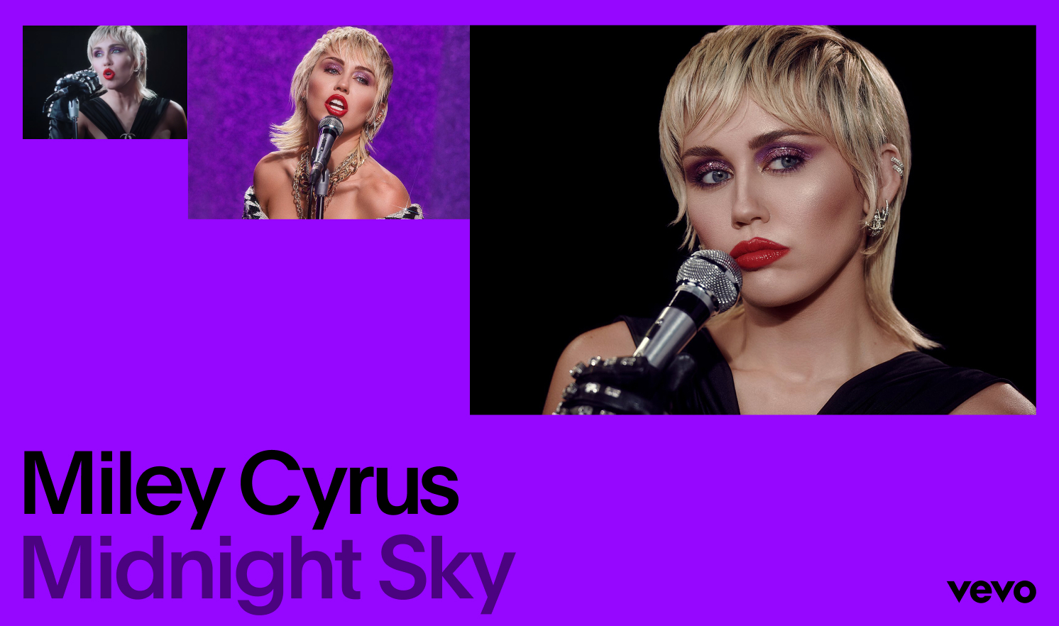
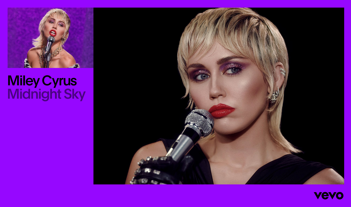
  3. Type and image combined
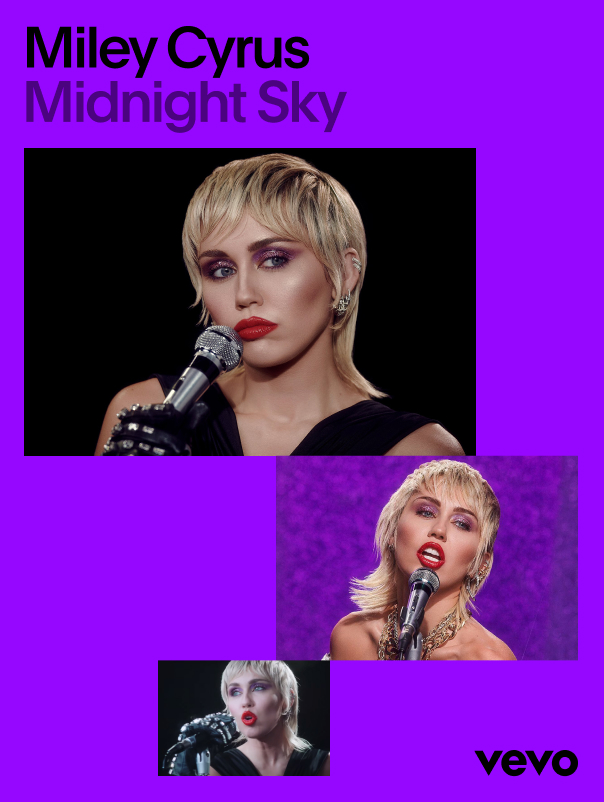
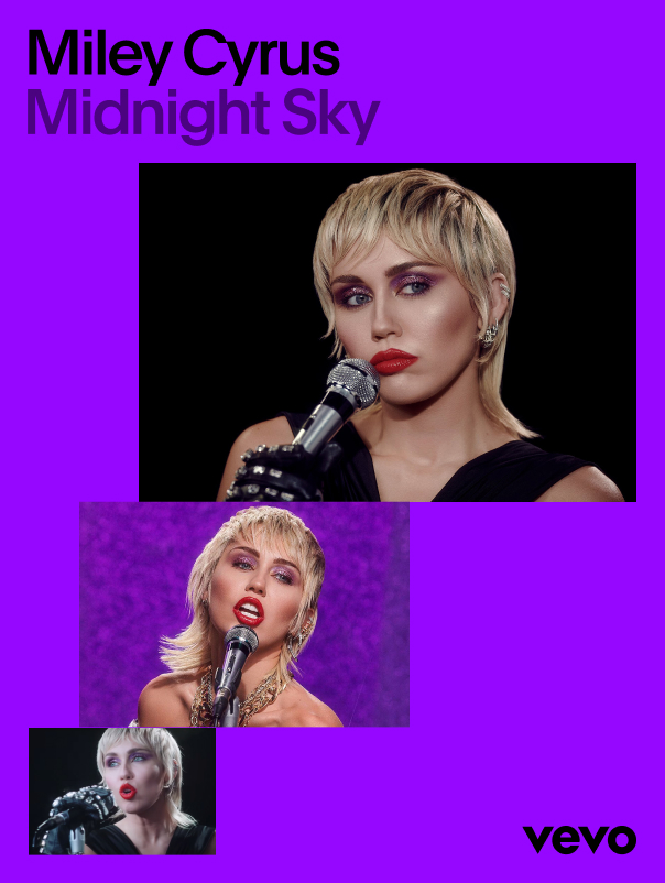
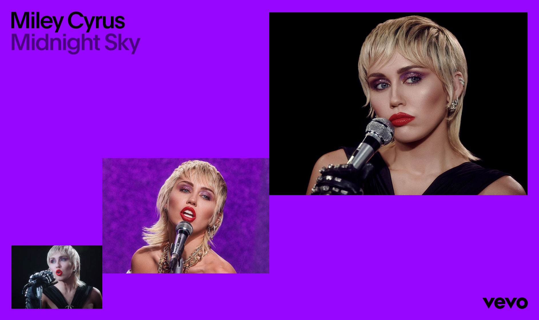
 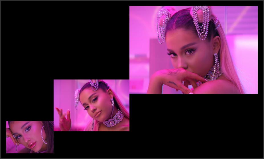 4. Type and multiple images
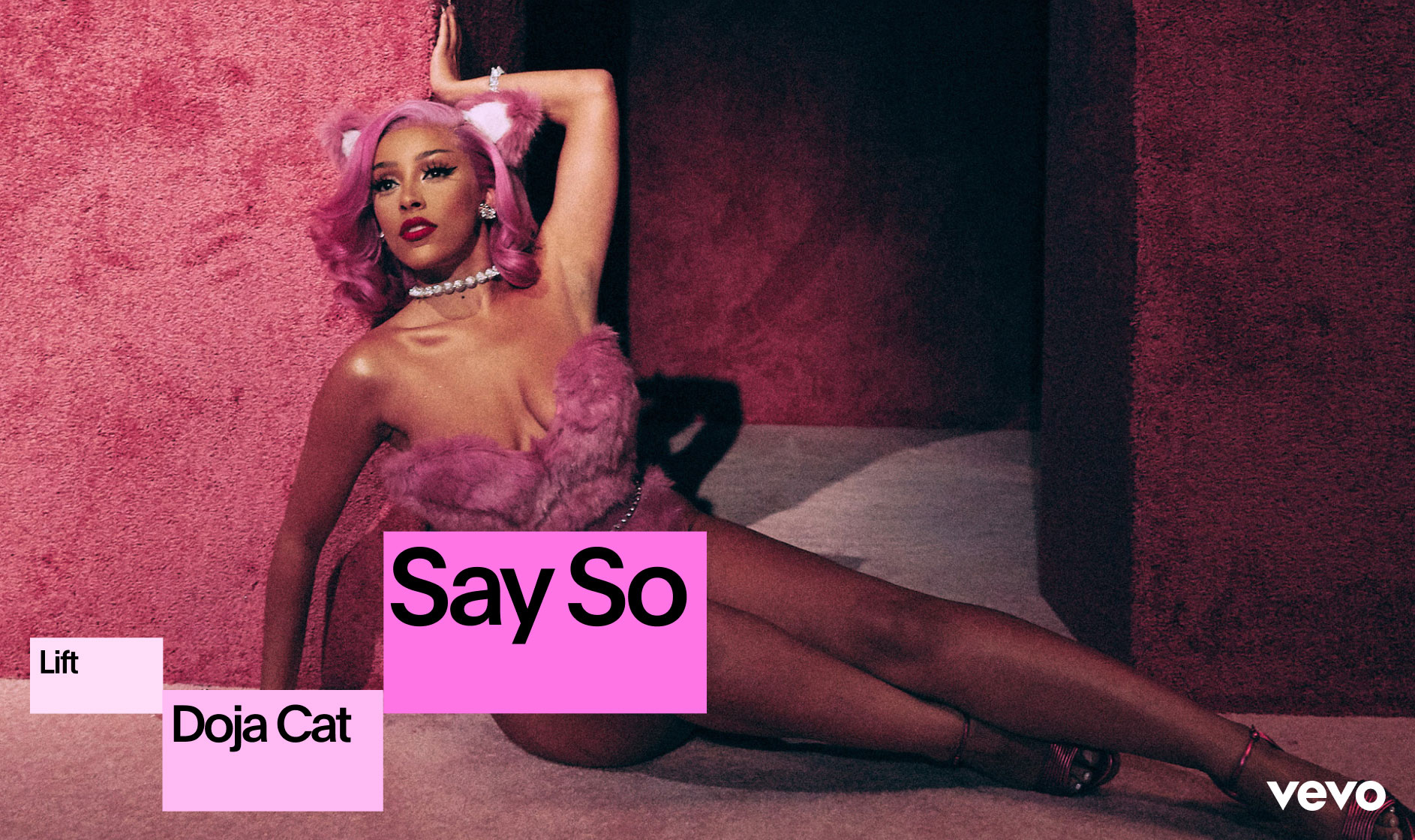
  1. Graphic blocks with imagery
  2. Graphic blocks on full-bleed image
  3. Graphic blocks and type only
 General Rules
Grid Setup
To keep things orderly and precise, we use a grid to organize information and guide layout creation. Below are the four main grids that should be used when building compositions.


General Rules
Margins
Margins are defined by the size and clearspace of our logo. When using the smaller logo, the margin becomes more narrow. When using the larger logo, the margin grows in size. This helps keep compositions proportional and consistent across the brand.
General Rules
Spacing
Always align logo, type, image and graphics to the grid, and make sure that the space between each element is equal to the margins.


Type-Led Layout
Construction
When laying out typography, it is important to keep things simple. Make it punchy, not too intricate or complex. Below are three options for placing typography within a composition.
 Avoid using more than three type sizes within a composition, and make sure that there is enough contrast in size between title and body copy.
 Type-Led Layout
Examples
Below are some examples of type-led layouts. Use the toggle on the right to show or hide the grid. Notice how the spacing and alignment is always consistent. This helps create consistency across all layouts, regardless of complexity.


Type-Led Layout
Don’ts
When laying out typography, make sure to keep things simple. Below are some common mistakes that should be avoided.
 1. Typography should never be vertical.
  2. Headline copy should be kept short.
  3. Never right-align typography.
  4. Do not place type or logo outside of margins.
  5. Do not set margins that are larger than the logo clearspace.
  6. Never align blocks of copy to different points within the composition.
 Single Image
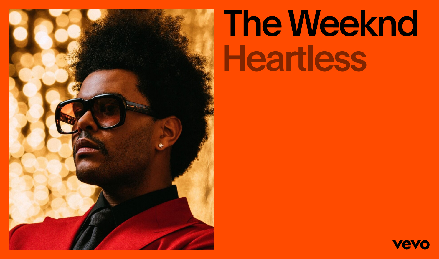
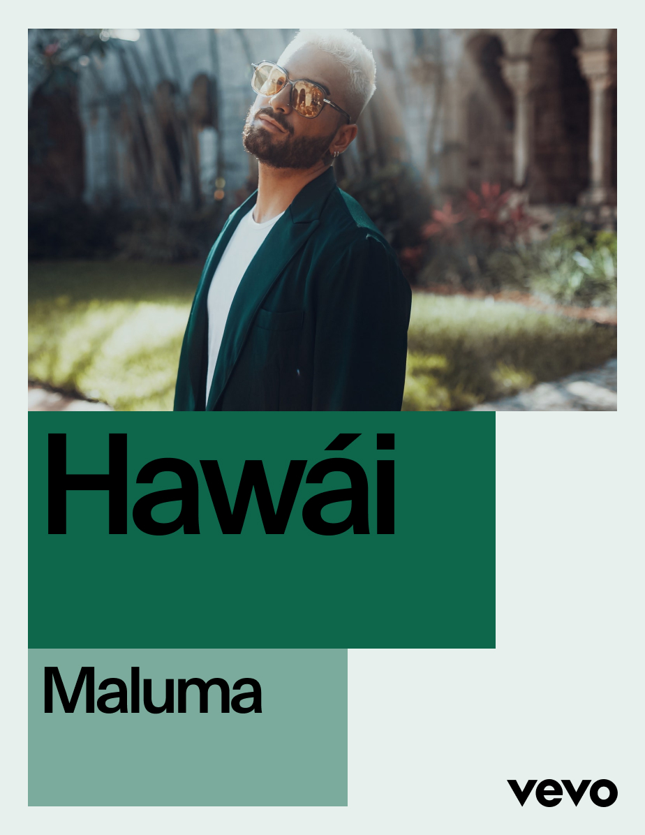
Construction
When combining typography with imagery, try to keep things simple and make sure to align all of the elements on the page in accordance with the margins. The space between the imagery and typography should be the same as the logo clearspace.


Logo and Image Separate
Where possible, logo and image should be separate.
This upholds the integrity of the mark and ensures
that it gets enough attention within the composition.


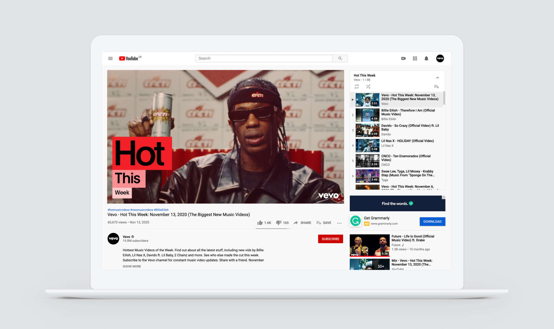
Logo on Image
Sometimes, when we want to make space within the composition, the logo is placed on top of the image. In these instances, type follows the color of the logo.
Single Image
Examples
Below are some examples of how to combine type and imagery. With the rules outlined above, our system can accommodate different layout possibilities that feel consistent despite their variety.
Vertical
Vertical


Landscape


Further Examples


Single Image
Don’ts
Below are some common things to avoid when combining type with imagery.
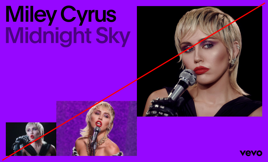
 1. Imagery should always lock to the margins.
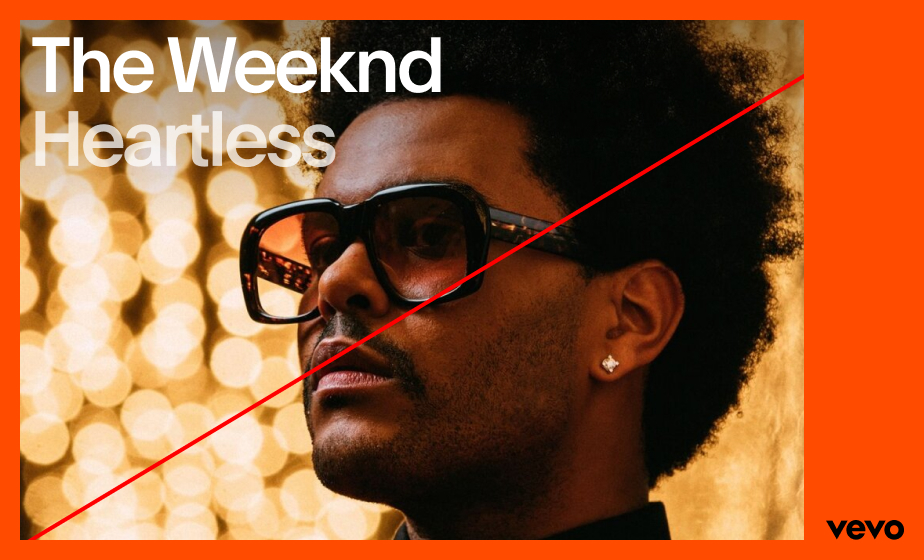
 2. Do not left-align the logo unless absolutely necessary.
 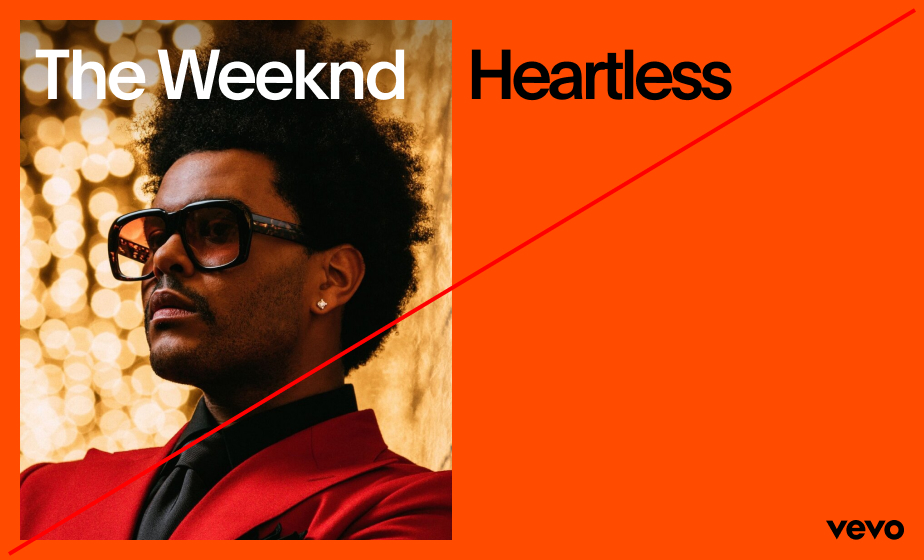 4. Do not combine type on image and type off image.
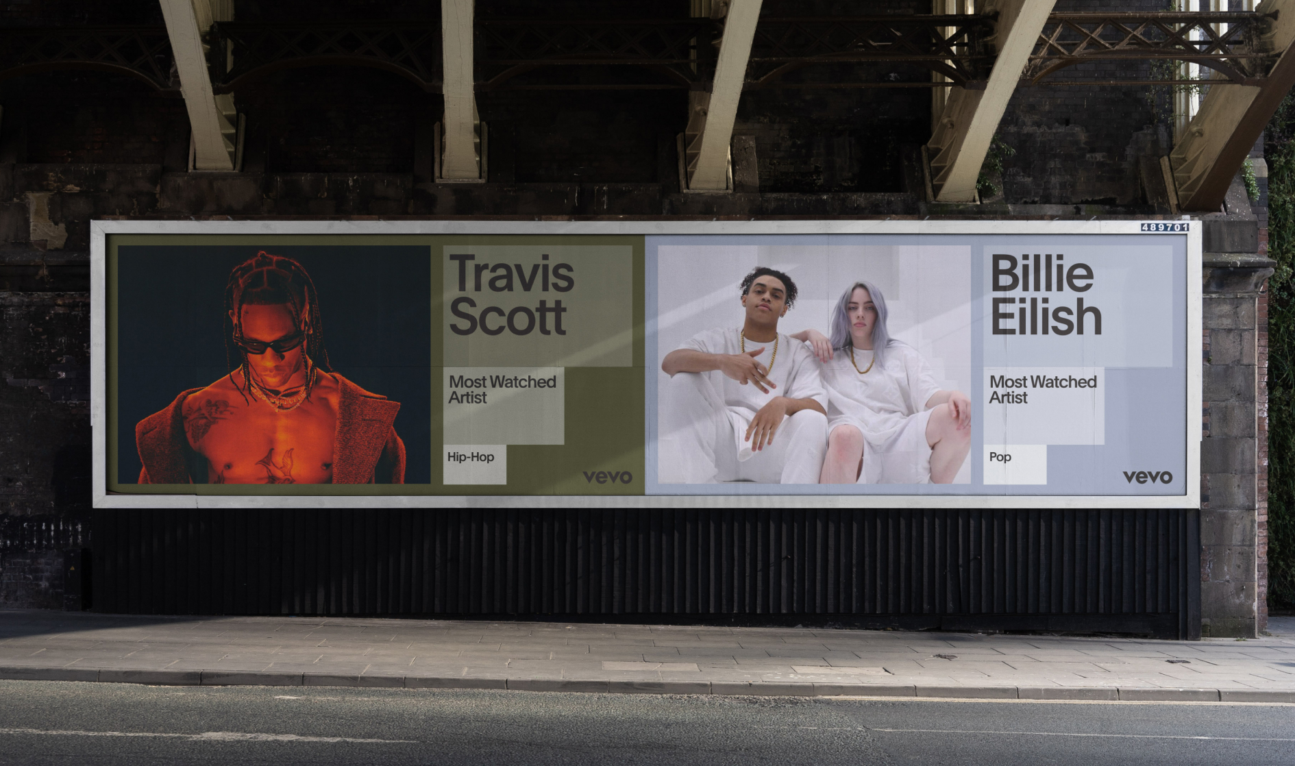
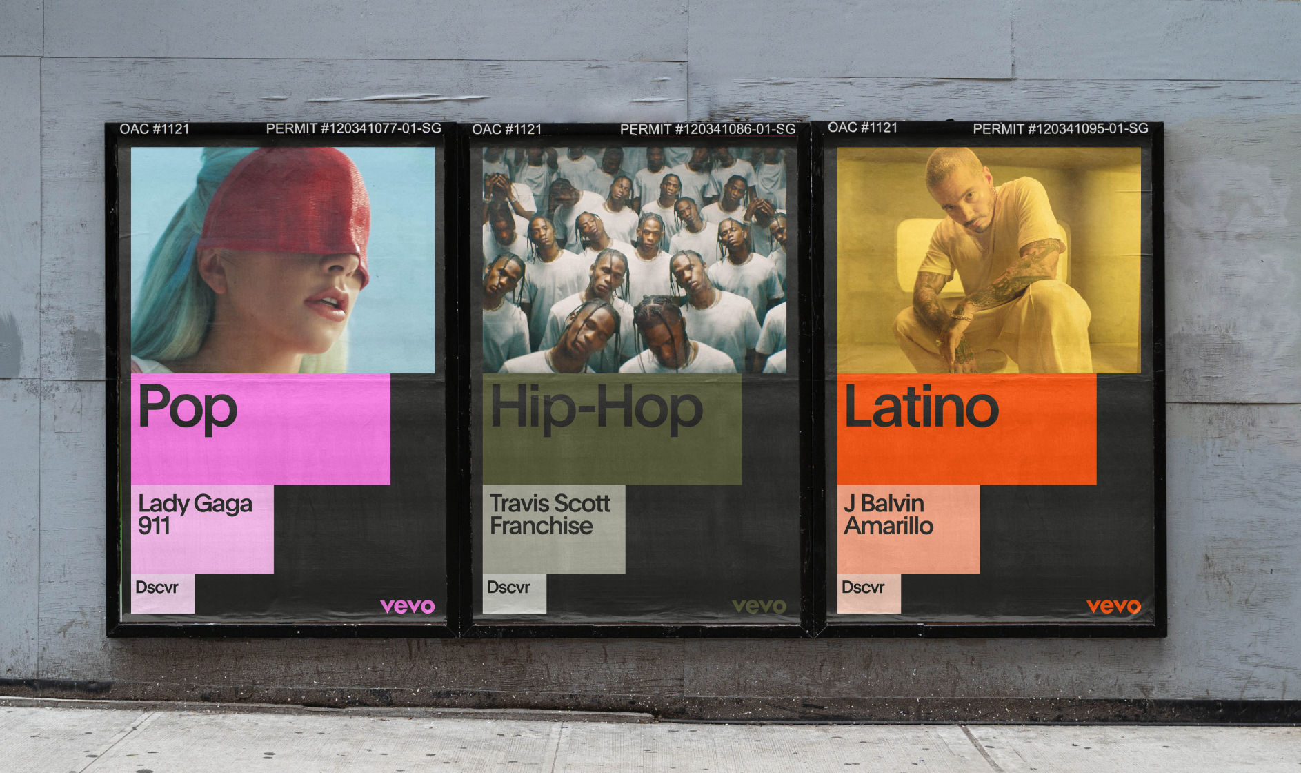
 Multiple Images
Construction
When combining imagery, scale becomes an important factor in dictating the size of the image and its relationship to other images in the composition. Below are the three techniques that we use to scale and place imagery.


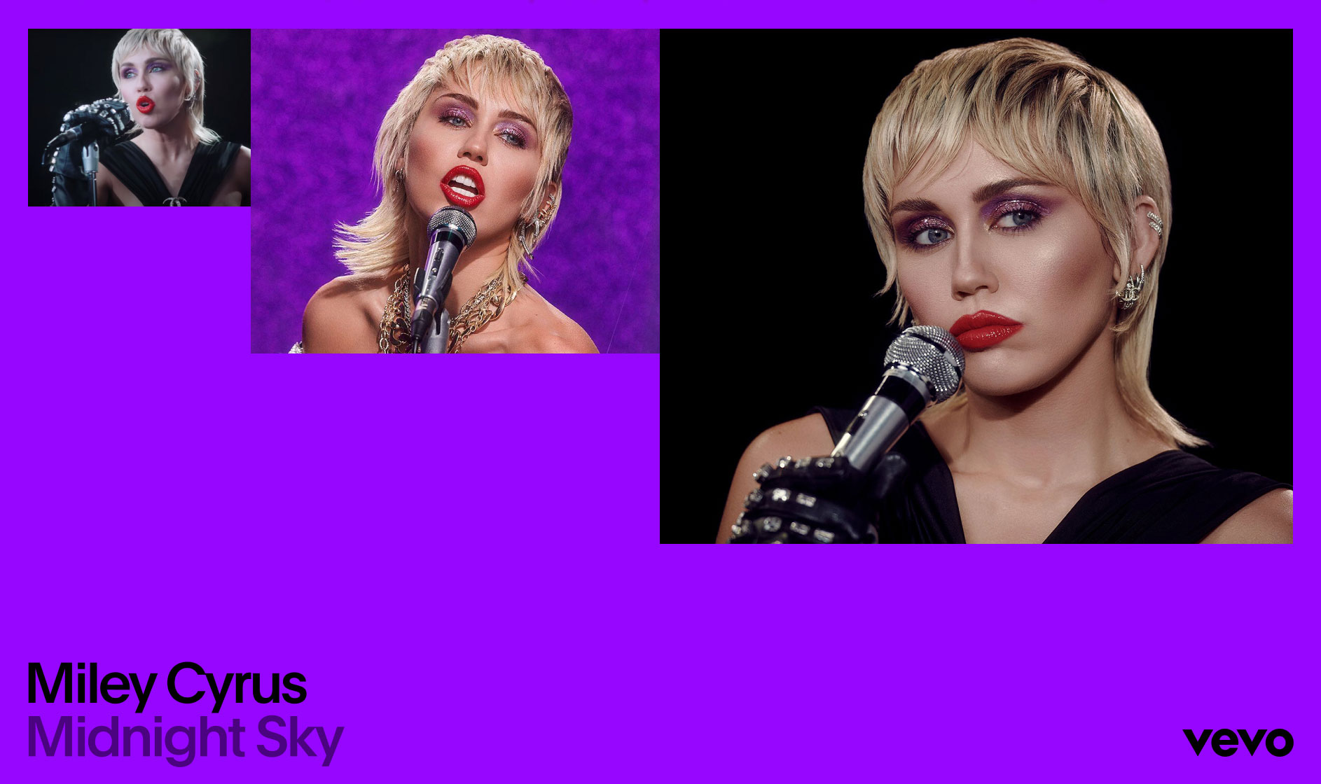
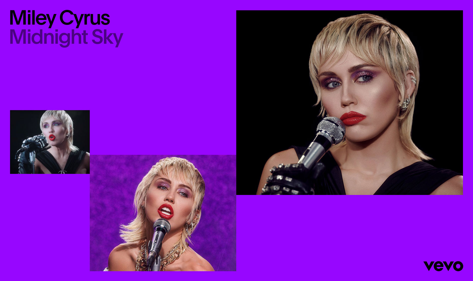
 1. Side by side
  2. Dip
  3. Staggered
 Sizing Guidance
 Always make sure there is enough constrast in size between each container.
  Our graphic containers should be sized proportionately to each other when possible.
 Multiple Images
Examples
Below are some examples of how to combine multiple images within one composition. The three techniques explored above allow for a variety of different layout possibilities without sacrificing overall cohesion.
Side by side


Dip

Staggered

Landscape

Landscape
Landscape
Further Examples


Multiple Images
Don’ts
Below are some common mistakes to avoid when combining type with multiple images.
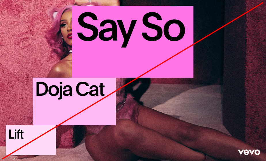
 1. Do not combine different image stacking techniques.
 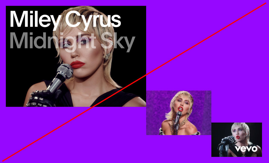 3. Do not place typography or logo above imagery.
 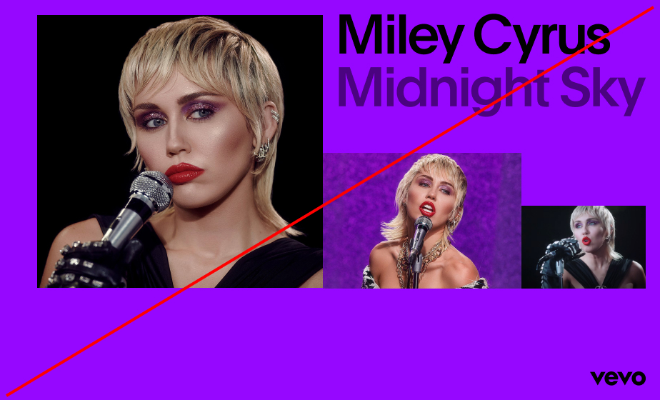 2. Always align imagery to margins and logo clearspace.
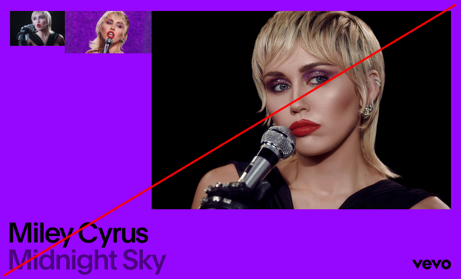
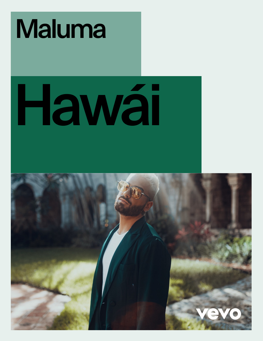
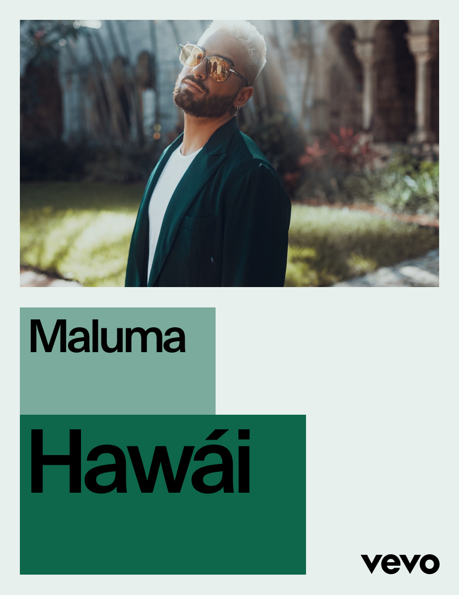
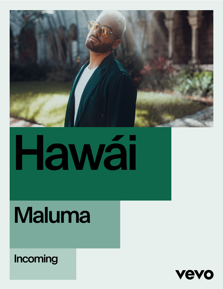
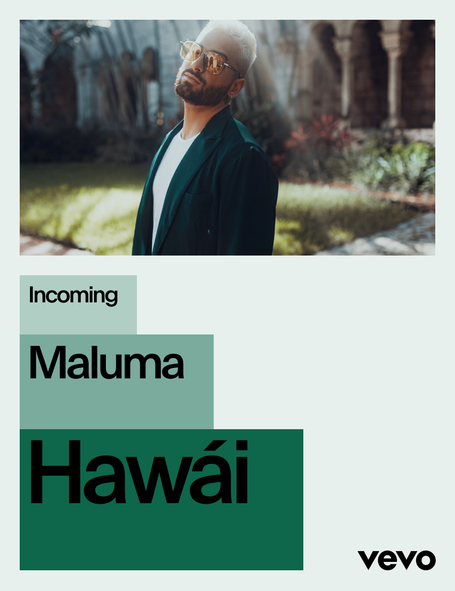
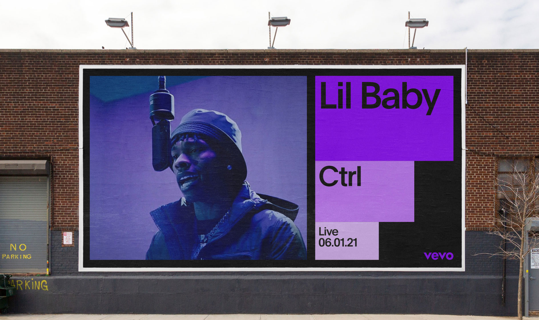
Graphic Blocks
Construction
Similar to the layout techniques above, our graphic blocks are used to convey a sense of scale and amplification. Coupled with secondary tones, they create depth and hierarchy within layouts. When creating compositions with graphic blocks, always use the ‘Side by side’ technique.
Stacking Techniques
 1. Side by side
  2. Dip
  3. Staggered
  Our graphic blocks should be sized proportionately to each other when possible.
  Always make sure there is enough constrast in size between each block.
 Graphic Blocks
Examples
Below are some examples of layouts that use the graphic blocks to house information and imagery.
Vertical
Vertical


Vertical

Landscape


Landscape


Vertical
Vertical


Vertical

Landscape


Landscape

Graphic Blocks
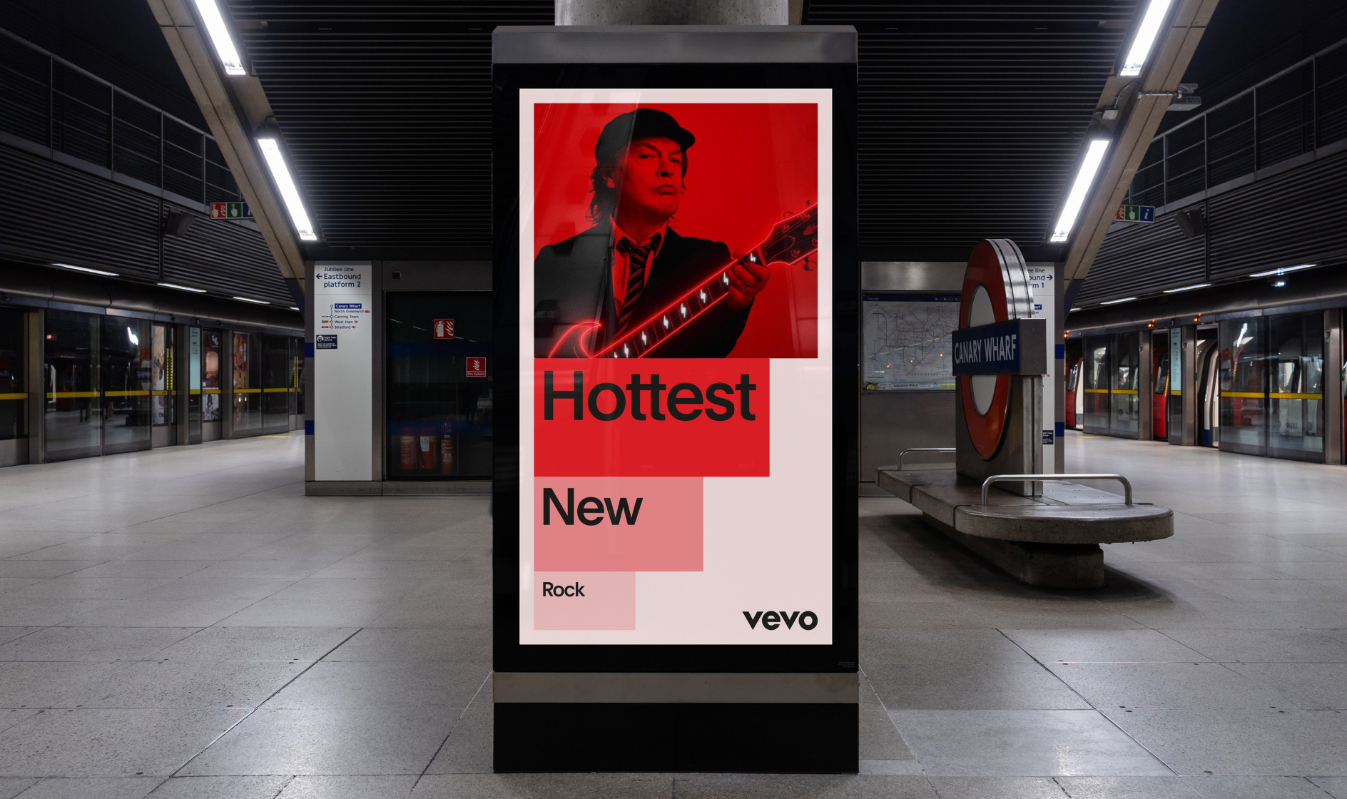
Full-Bleed Imagery
In certain moments such as lower-third animations and sign-offs, the graphic blocks can be used on full-bleed imagery. Below are some rules that ensure consistency when using the graphic blocks in these situations.
Safe Zone
 In this context, our graphic blocks should never extend beyond the composition’s midpoints, horizontally or vertically.
Stacking Techniques
 1. Side by side
  2. Dip
  3. Staggered


Graphic Blocks
Don’ts
Below are some common mistakes when applying graphic blocks to full-bleed imagery.
 1. Do not let the blocks conceal the subject.
 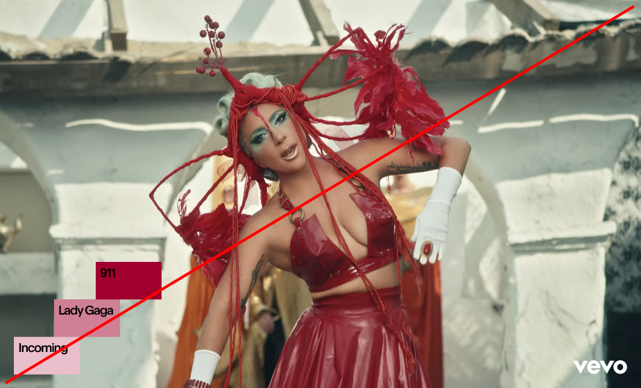 3. Make sure that there is a strong contrast between blocks.
 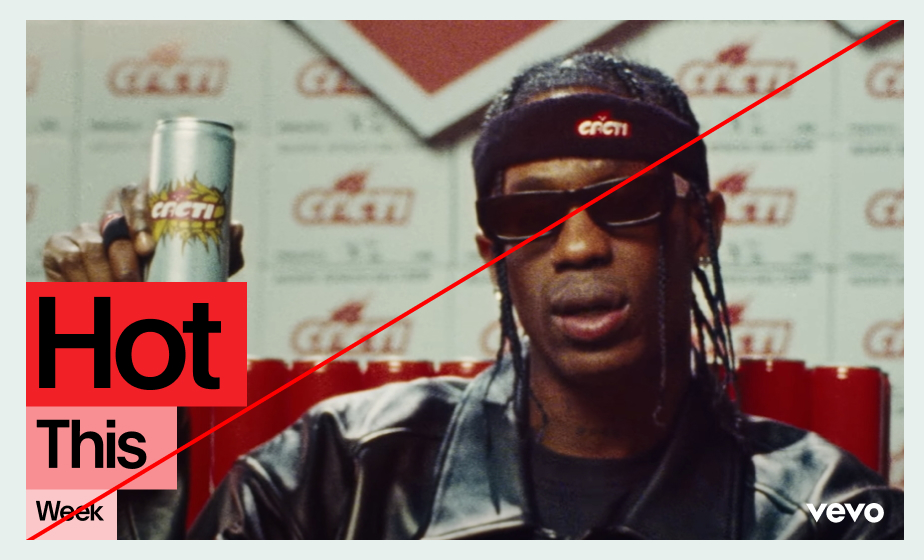 2. Do not place blocks inside imagery unless full-bleed.
 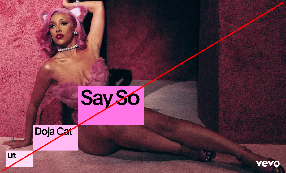 4. Do not join blocks at corners.
 Application Examples


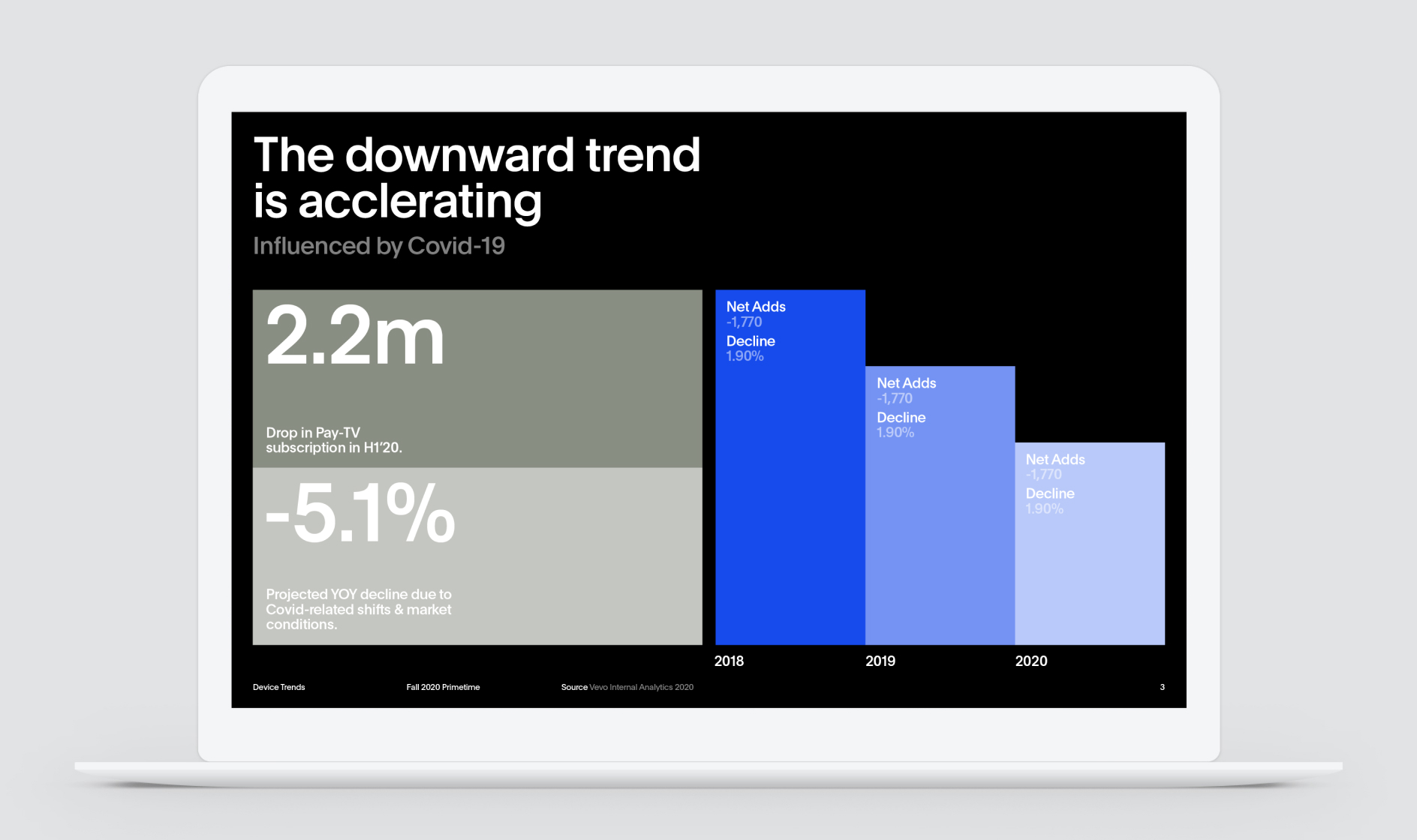
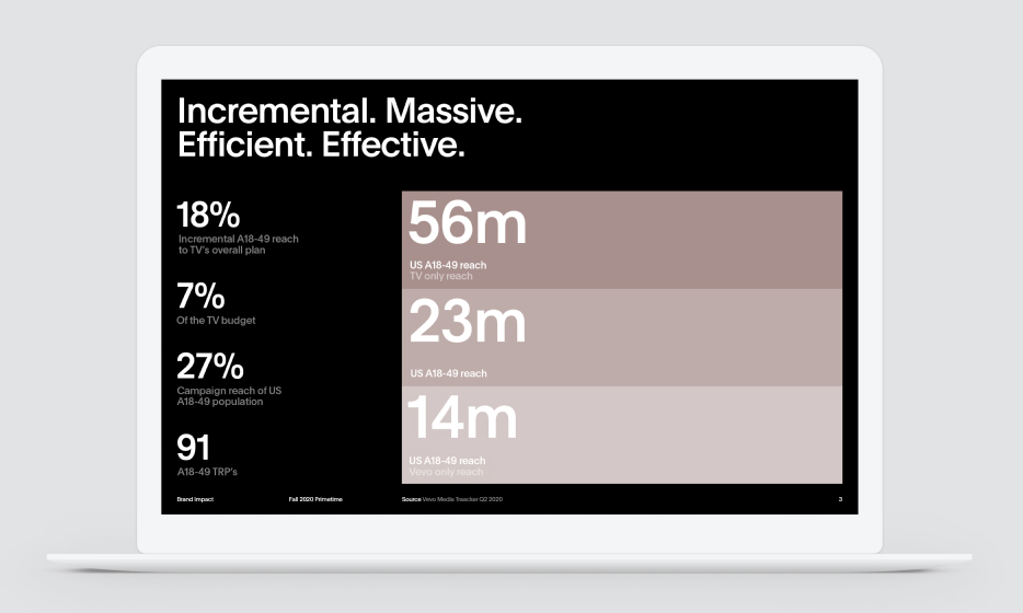
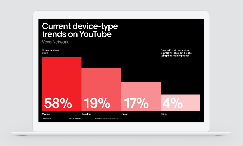
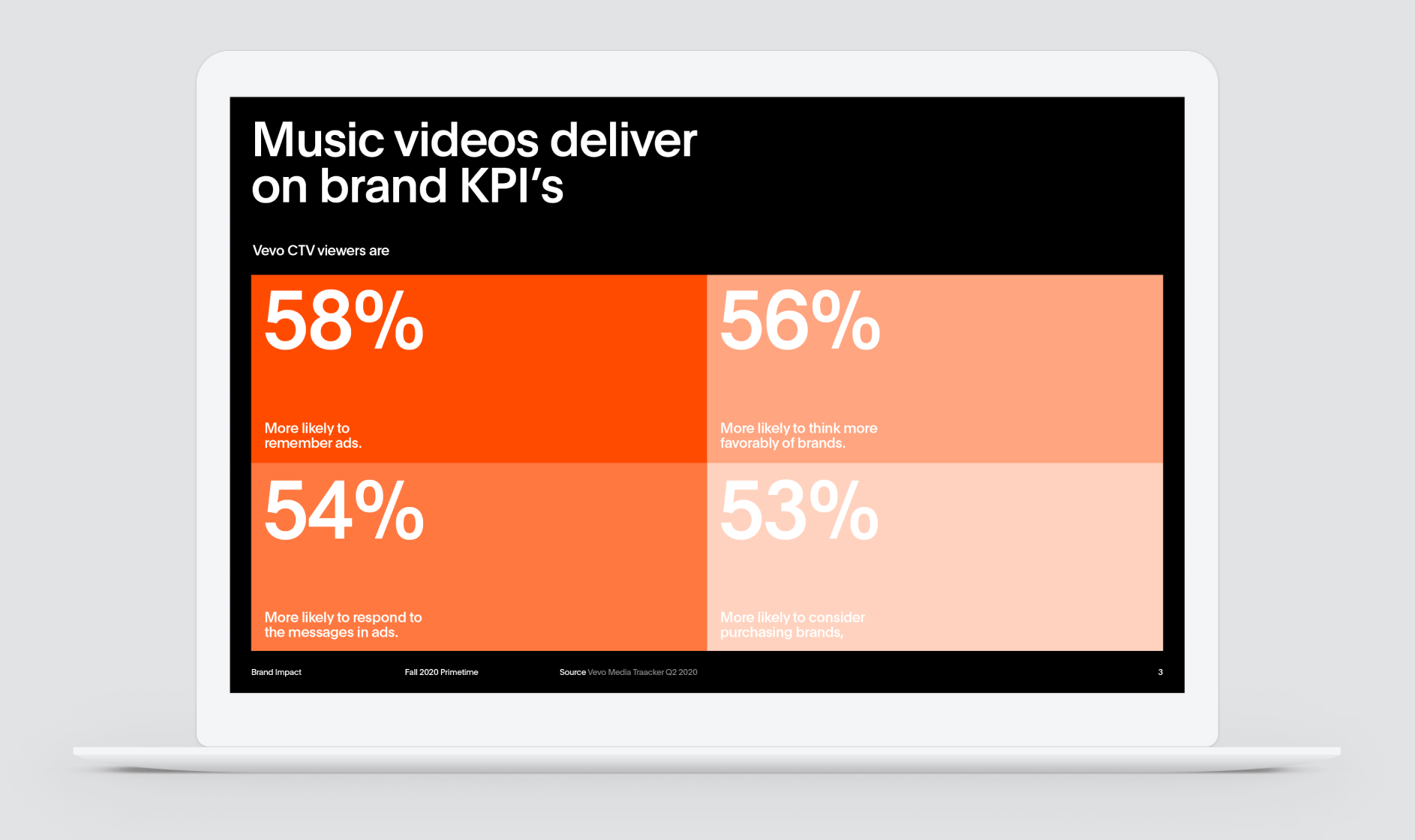
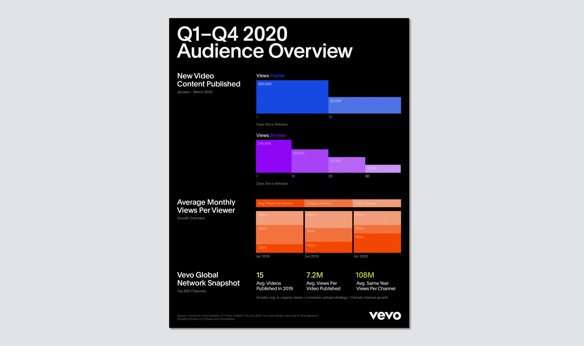
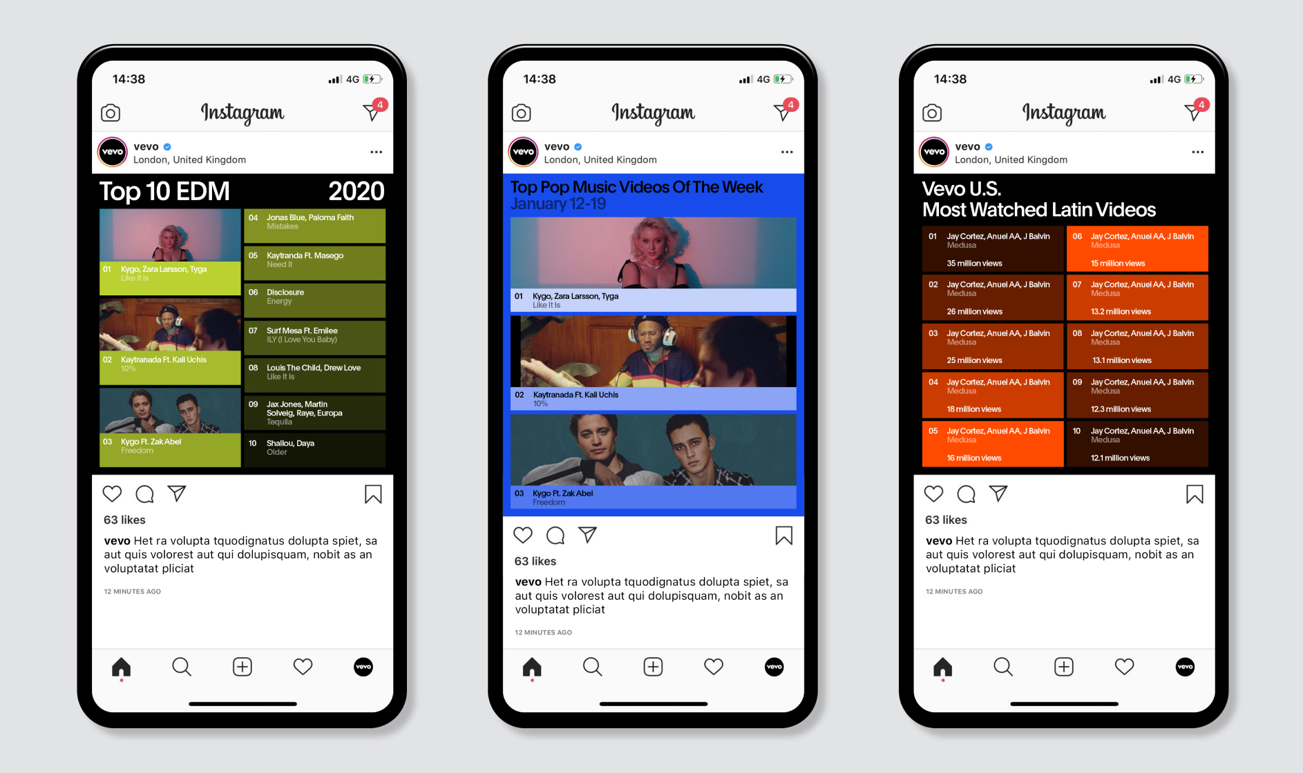
Infographics
Our graphic blocks can be a useful tool for containing large blocks of copy or visualising data. Always make sure that the lowest opacity or tint of the color blocks provides enough contrast for the typography to be easily read and understood.


 When using the blocks to visualise data, make sure the block with the largest number is using 100% tint or opacity.
Infographics
Application Examples