Logo
One of our most recognizable elements, the Vevo logo is known as the official stamp on music’s visual content. Consistently applied placements, clearspace, and color treatments ensure our logo remains iconic in any context.
Overview
The Vevo wordmark is a nod to the previous visual identity, creating a sense of nostalgia and honoring the most recognizable aspect of the brand. The sharp, geometric letterforms give the mark an expert sensibility that is ownable and helps set the brand apart.
Clearspace
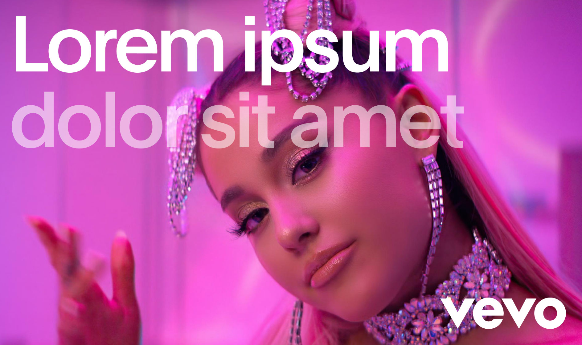
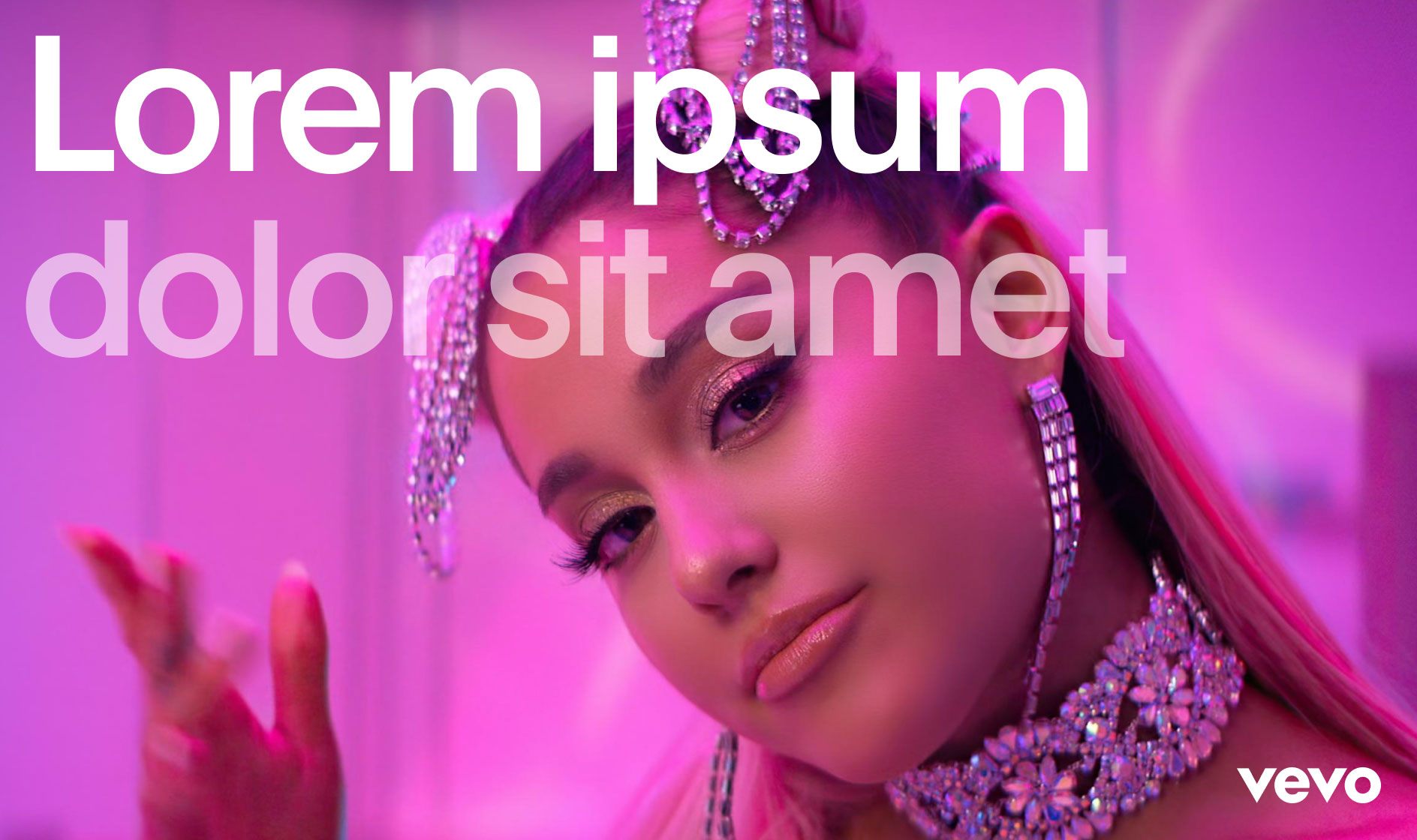
When applying our logo, it is paramount that it is given enough space from the margins and other elements on the page. Two clearspaces have been developed that shift in size depending on the size of the mark. Everything starts with the logo.
Clearspace
Web & Tablet
For web and tablet, a minimum clearspace above and below the logo should be 20px height, but is always determined by web / mobile design. This should always align with page margins.
Brand Architecture
The simplicity of the Vevo logo allows it to be locked up to various different brand categories. However, these lockups are all slightly different to ensure that there is enough distinction across the brand. Below are the four main categories.
Brand Architecture
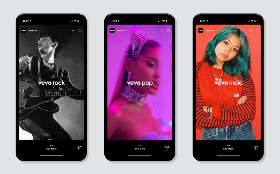
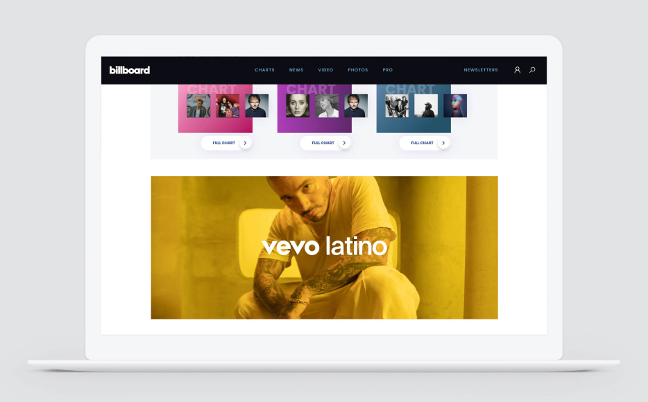
Genres
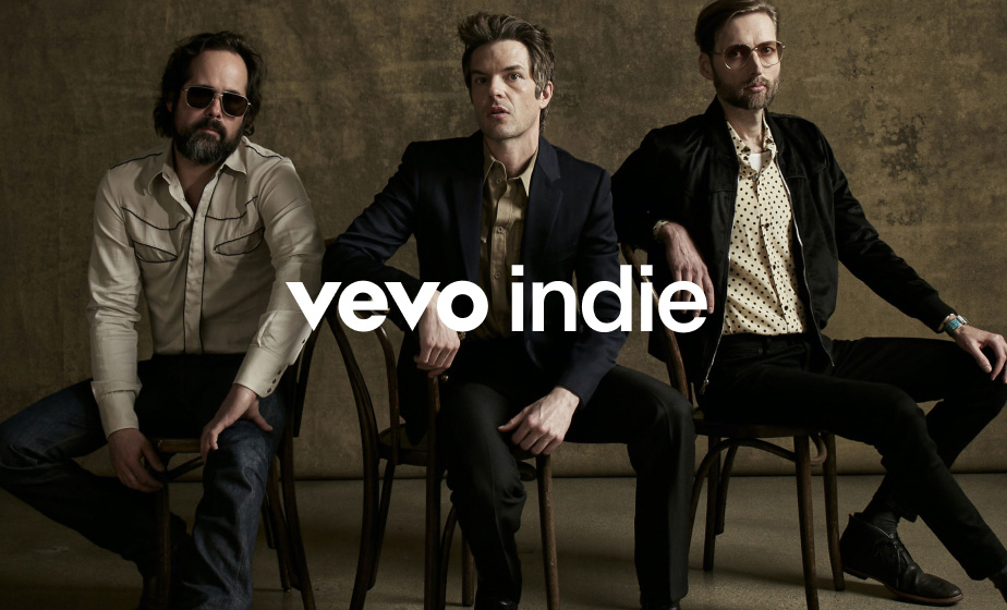
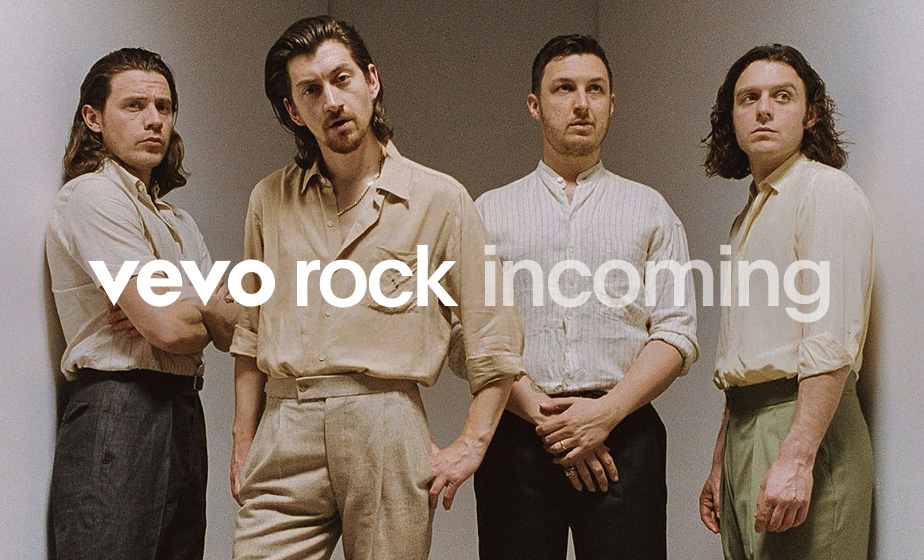
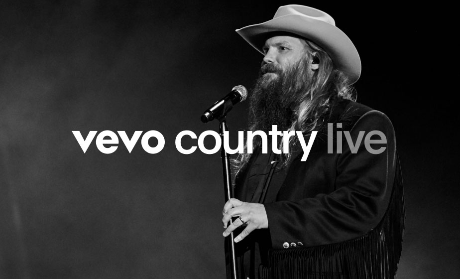
The Vevo logo can be locked up to the left of genres, with a space between them that equals half the width of the Vevo “O”. Sticking to this construction will ensure there is consistency across the many different genre lockups.




Brand Architecture
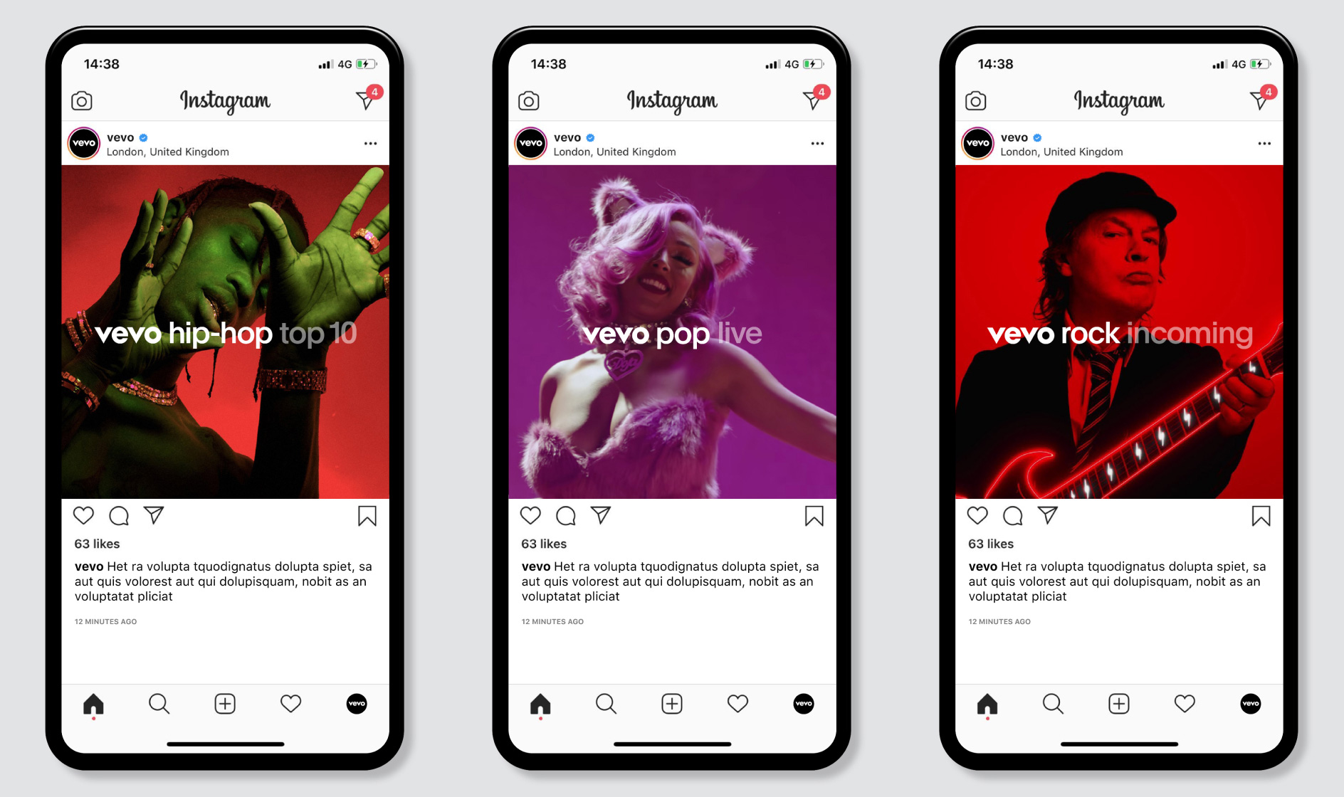
Genre Sub-Categories
Opacity is used to further distinguish sub-categories that relate to each genre. Using 100% and 50% opacities ensures there is a clear distinction between the different categories.



Brand Architecture
Partnerships
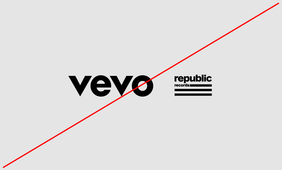
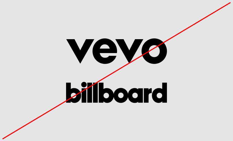
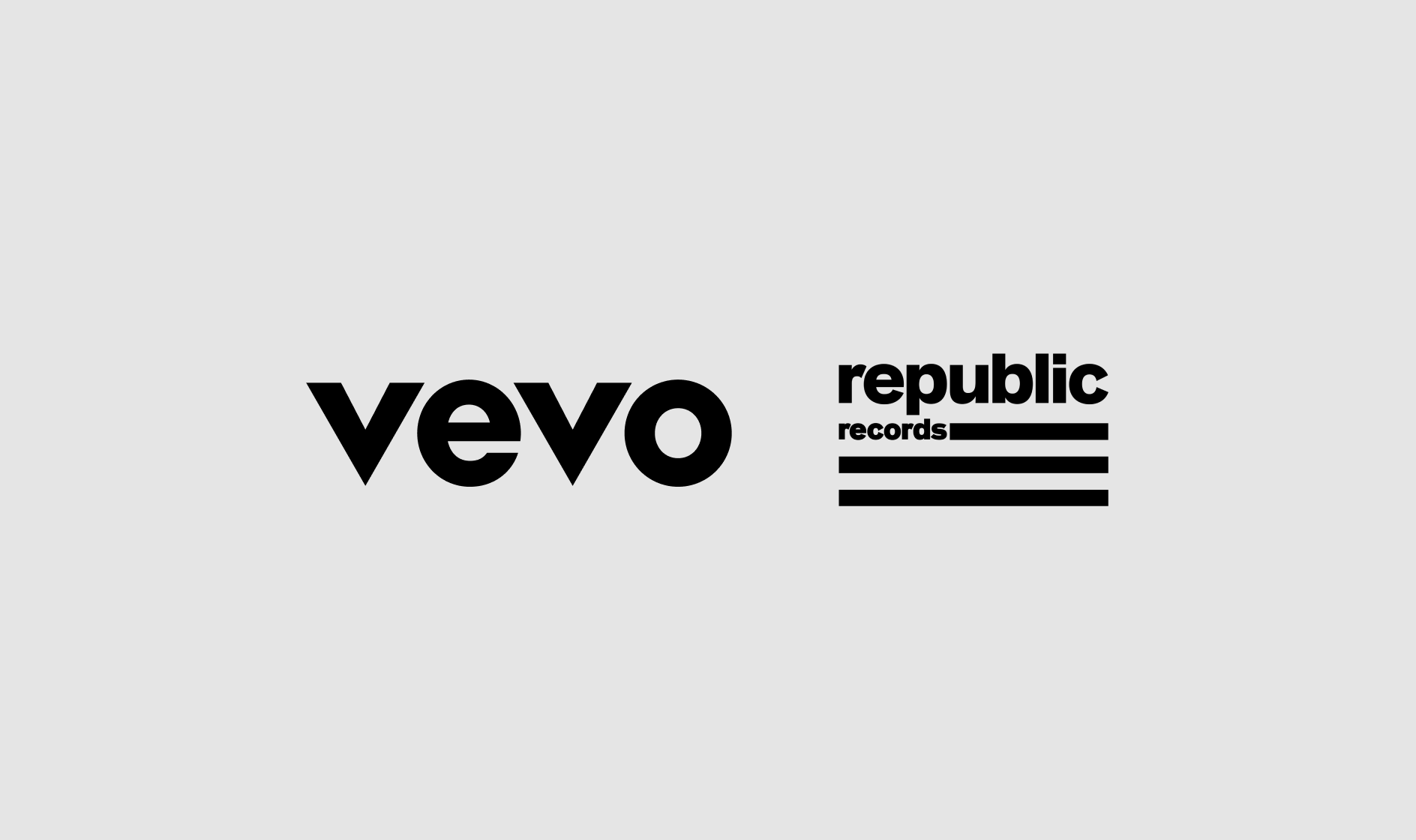
For brand partnerships, the space between the two logos should equal the width of the Vevo “O.” When sizing the logos, start with the Vevo logo, then optically size and center the partner logo to achieve visual balance.
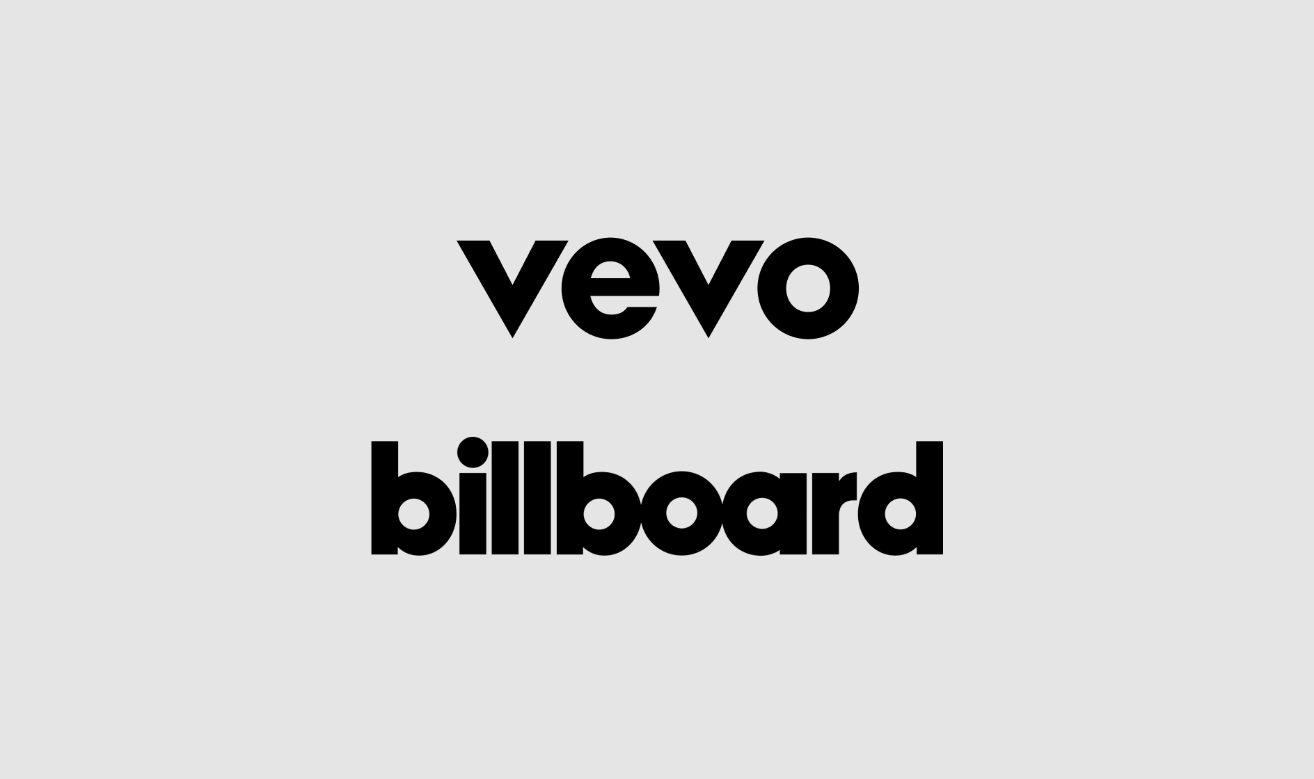
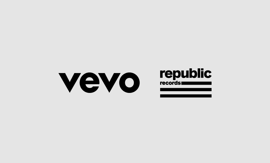
Always make sure that logos are optically sized; do not attempt to match height or width.
Brand Architecture
Partnerships Hierarchy
This section expands on the different hierarchy options when collaborating or partnering with other brands. Depending on the nature of the collaboration, the Vevo logo may not lead in the lockup or composition—this is fine. The section below outlines different options for these scenarios.


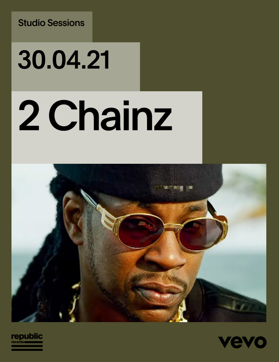
Brand Architecture
Original Content
Unlike the previous categories, the relationship between the Vevo logo and the original content migth vary depending on the channel. To create a feeling of consistency across all channels, sizing must follow the guidance below. The channel name can then be designed following layout and typography rules.
Work in Progress
Typographic
Graphic Device
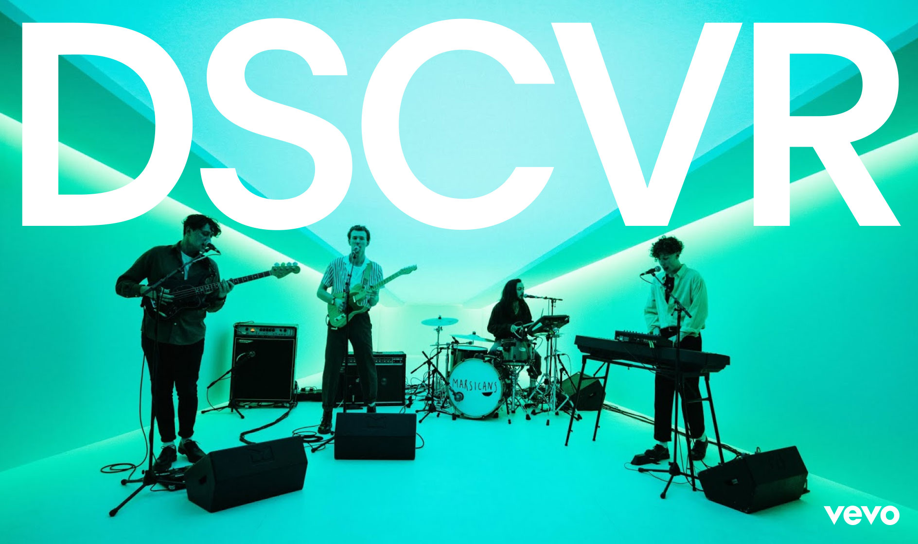


Brand Architecture
Hosts
The host logo should be locked up centrally beneath the Vevo logo. It should never be larger than one third the size of the Vevo logo.
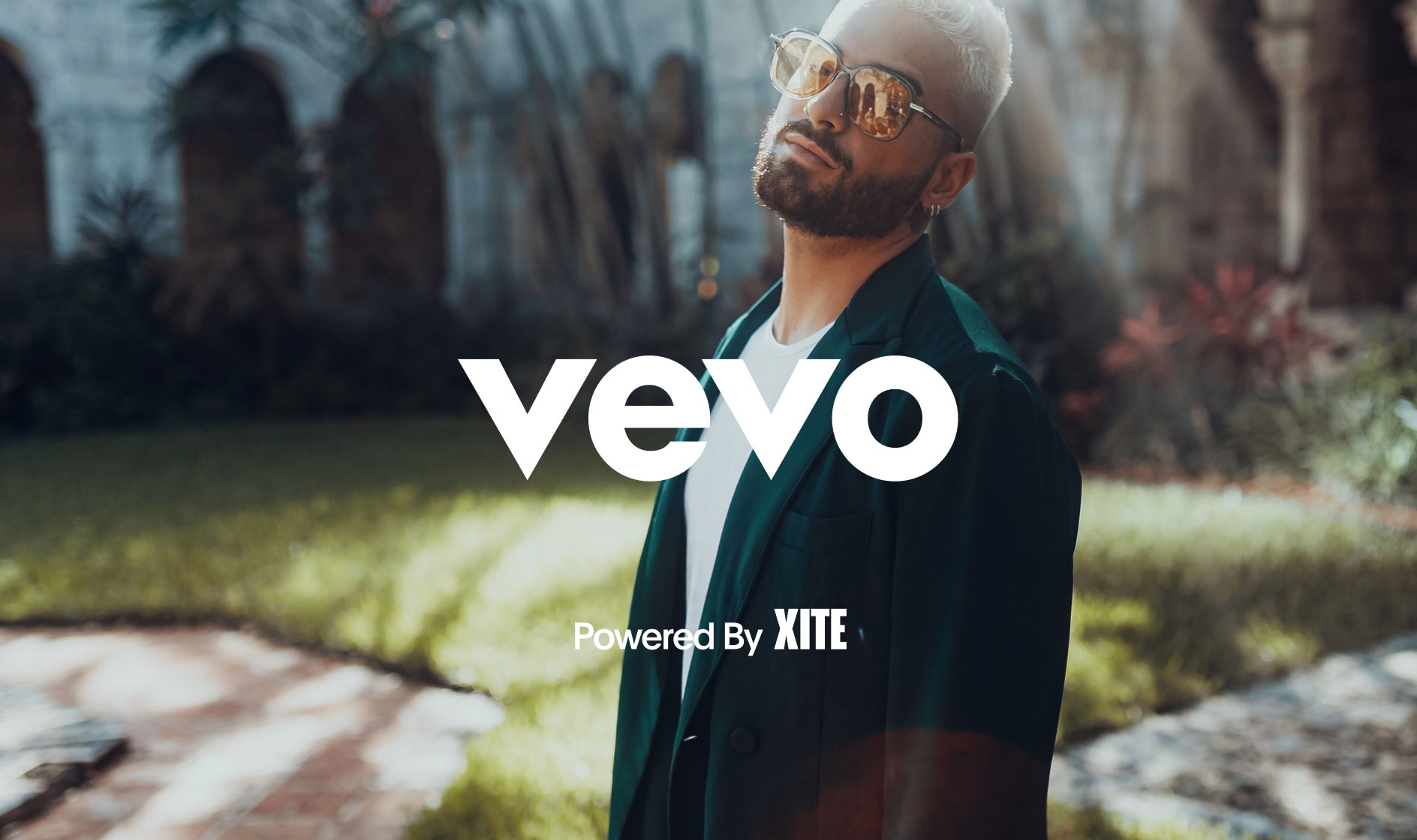
Brand Architecture
Application Examples
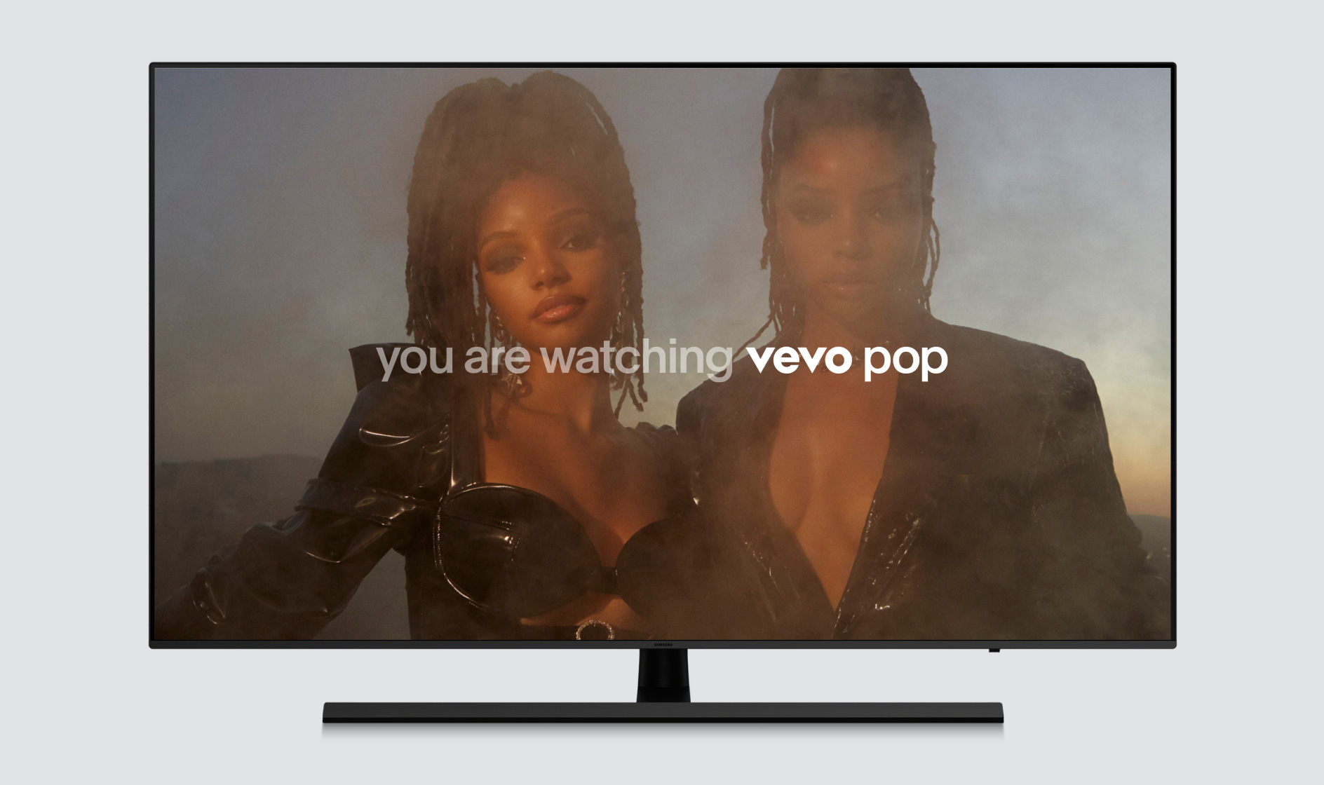
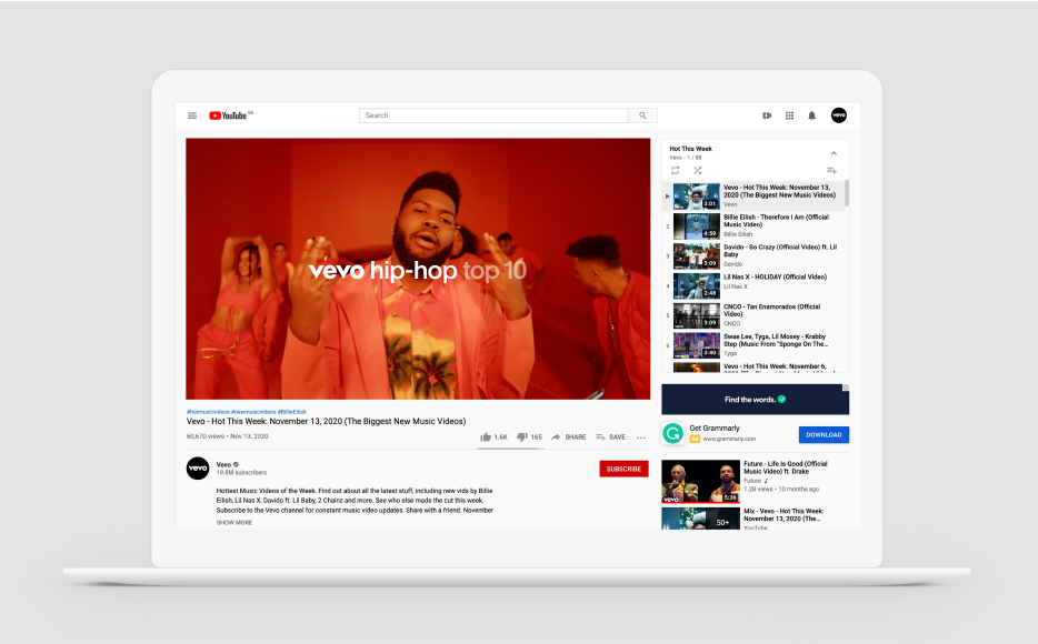
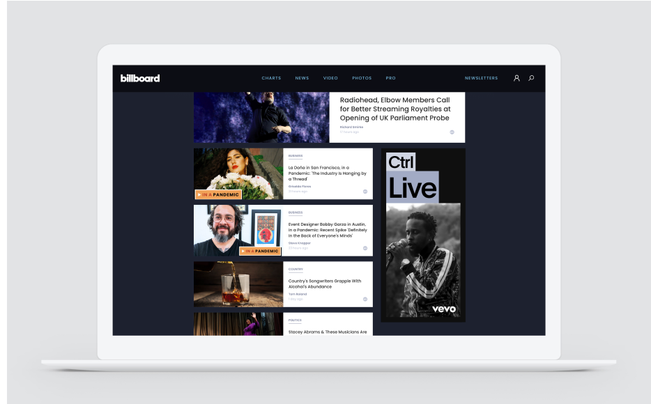
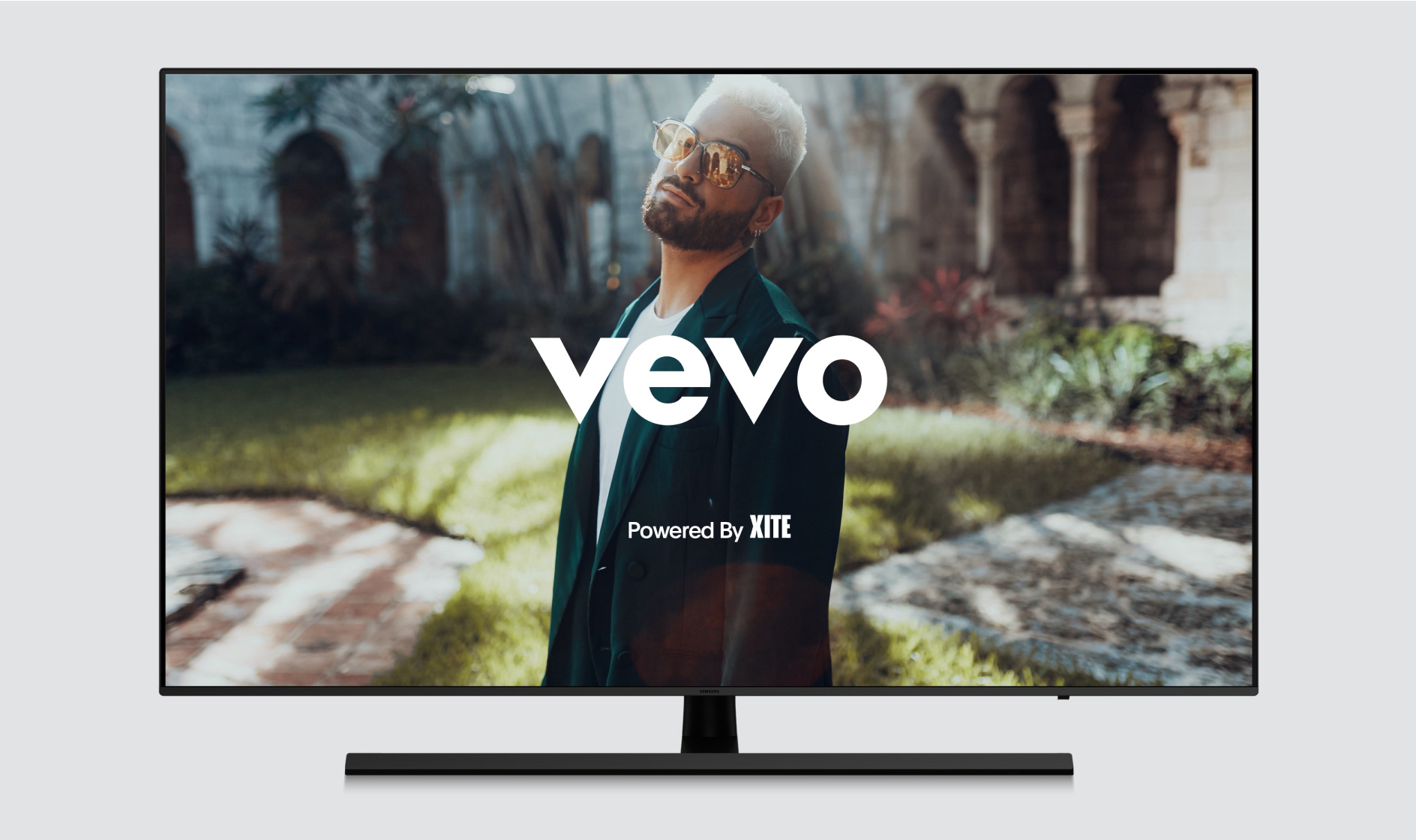
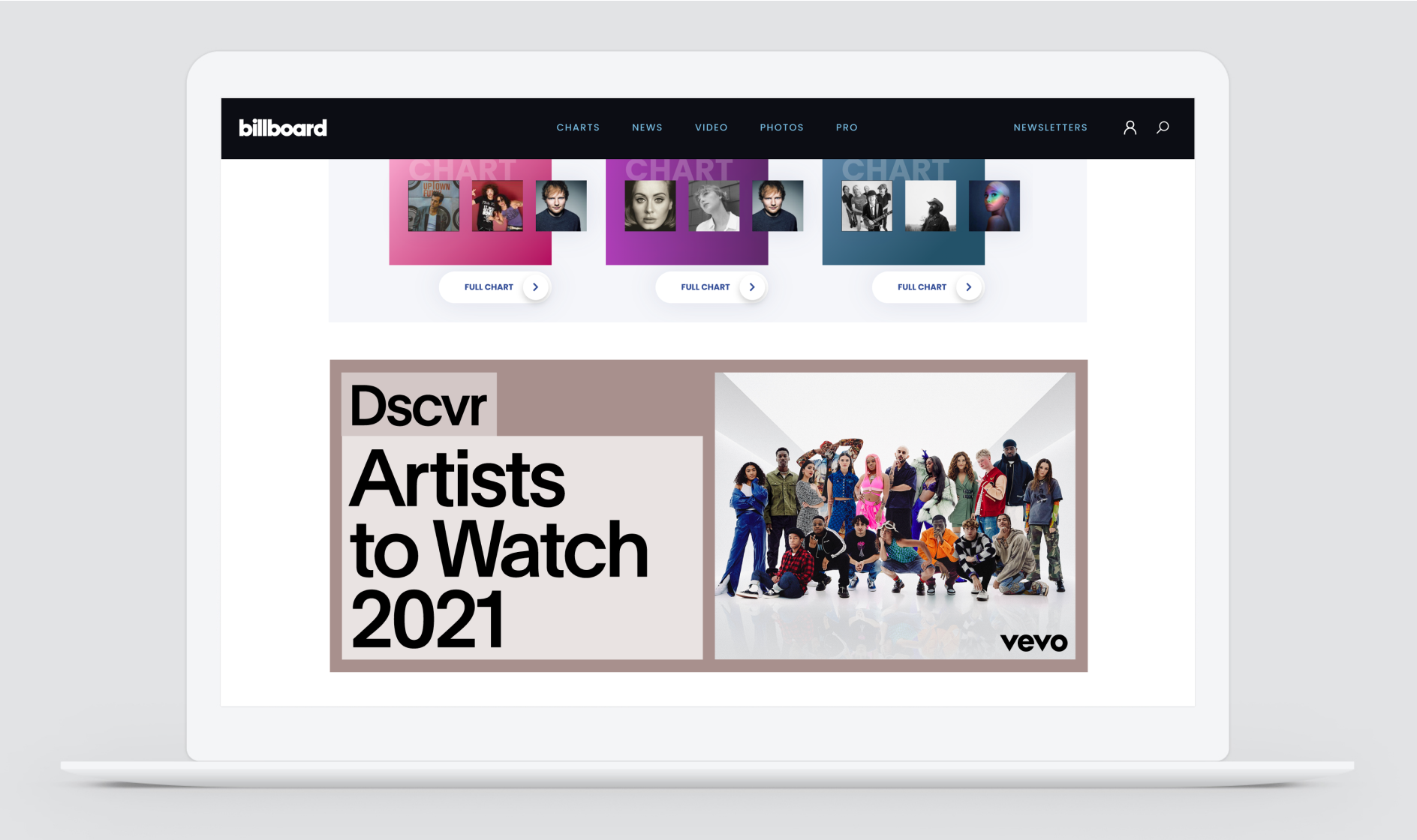
Scalability
The Vevo logo was designed and tested to work at various sizes. The minimum logo size for adequate legibility is 10px height. Never go smaller than this, though. Establishing a minimum size helps ensure that the logo’s legibility is never compromised.
Color Options
The Vevo logo should only be used with black, white, and colors from our core palette. If applying the logo over imagery, always ensure there is enough contrast between logo and image to make the wordmark clearly legible.
Logo Misuse
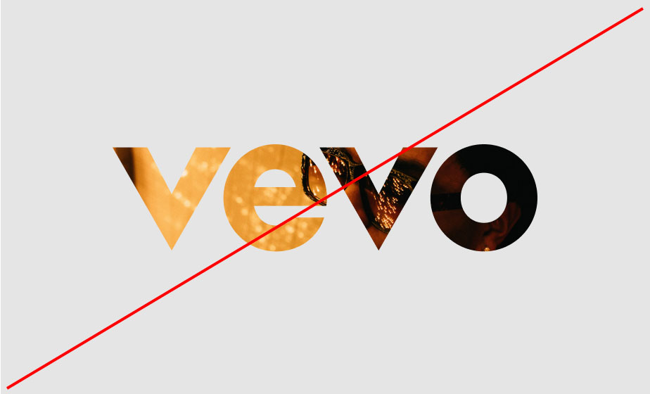
It is important that the appearance of the logo remains consistent. It should not be reinterpreted, modified or embellished. No attempt should be made to alter the logo in any way. Below are some mistakes to avoid.
Logo Placement
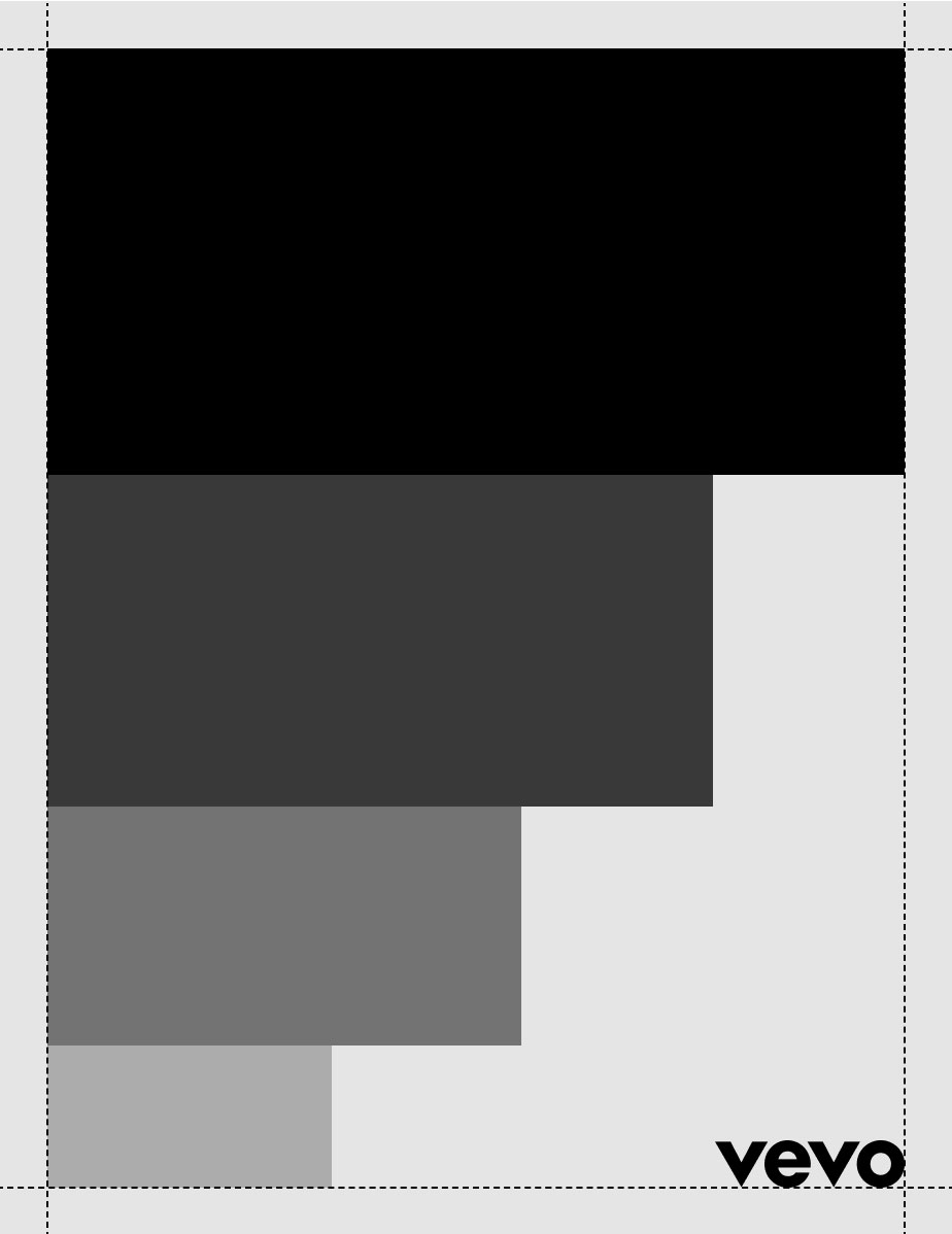
Regardless of communication size or composition, the logo should always be placed in one of the locations outlined below. This keeps logo placement simple and consistent, while offering enough flexibility to accomodate a variety of layouts.
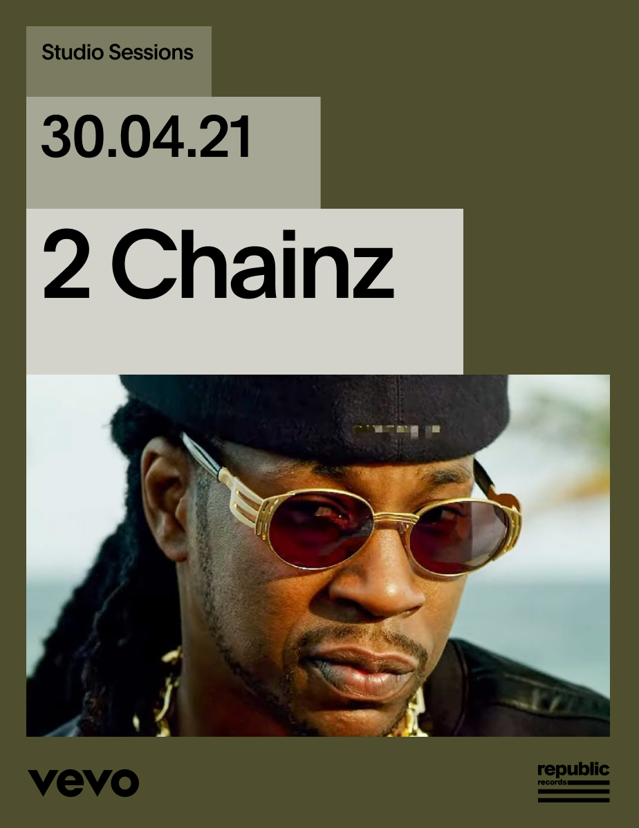
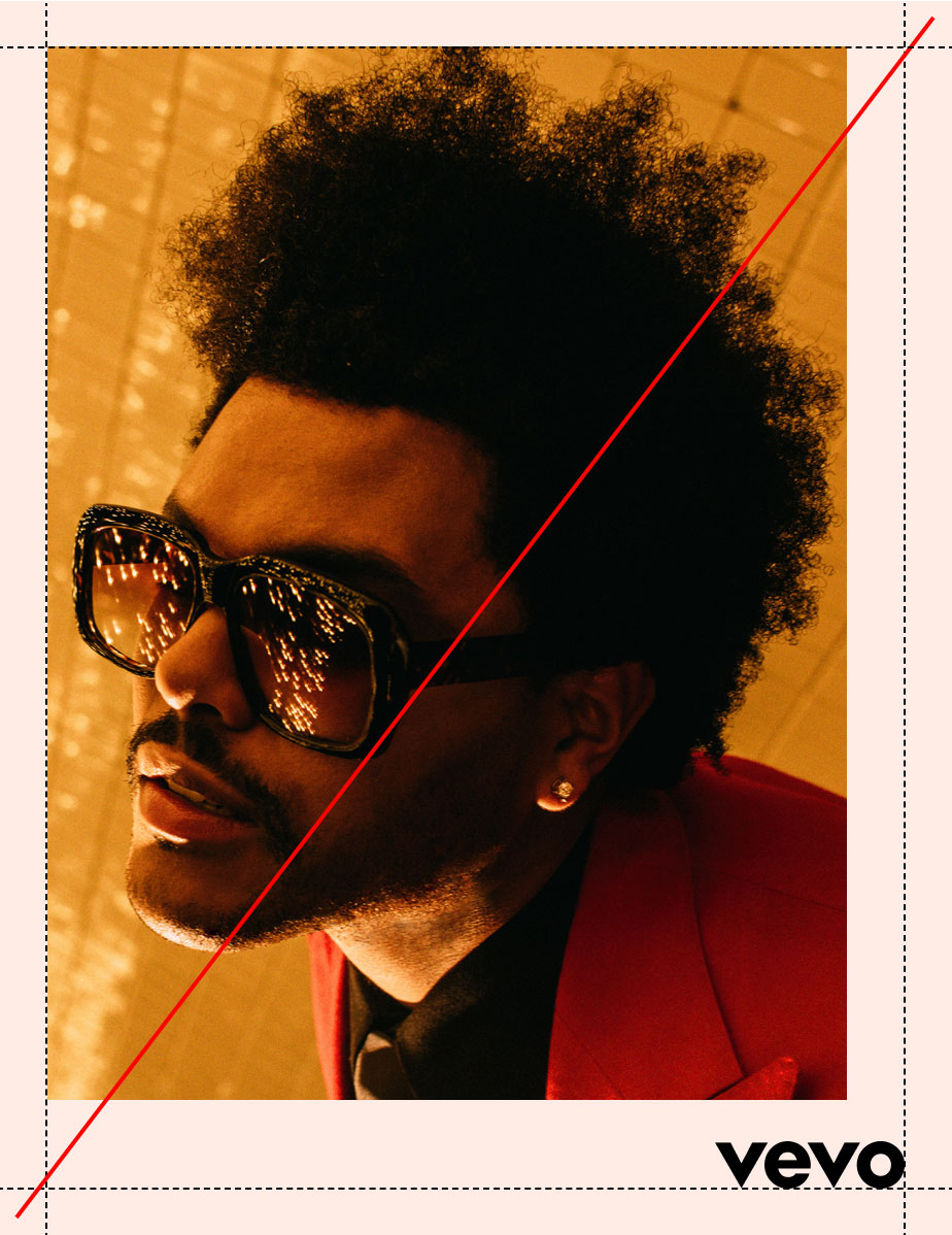
Where possible, our logo should be applied in the bottom right of compositions. In doing so, we celebrate the iconic placement of the logo in music videos, and build on exisiting brand equity.
Logo Placement
Alignment
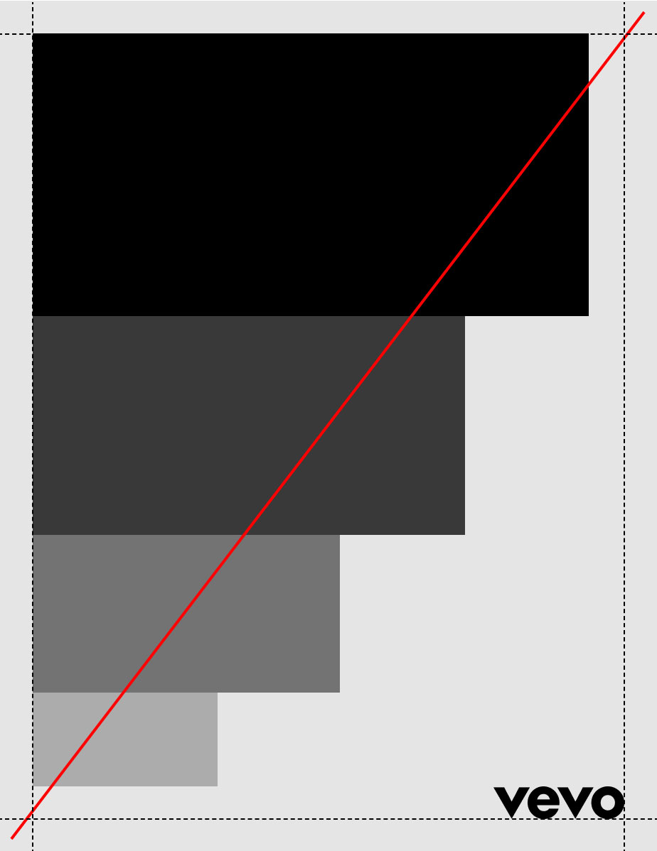
When combining the logo with other elements in the composition, it is important that these elements are aligned to both the page margins and the logo itself.

Logo Placement
Photography
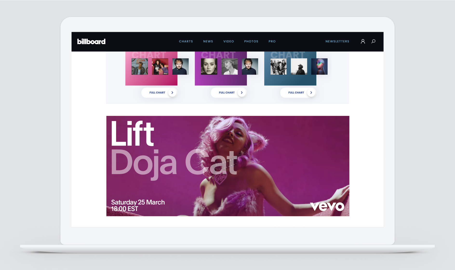
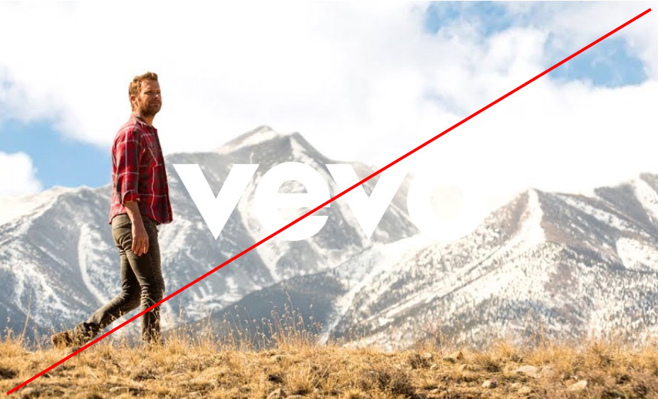
In certain instances, the logo might be placed on top of photography. In these cases, the logo should always be placed in the center or bottom right of the image.


Logo Clarity
When creating a composition, it is important to have enough contrast between background and logo to maximize legibility. Below are some do’s and don’ts for logo clarity.

Logo As Typeface
In many cases, we will need to refer to Vevo within a sentence or paragraph. Never use the logo in these situations. Always use our brand typeface, Plain, in the same weight as the rest of the copy.
Icons
Construction
The construction of icons must respect clearspace and give the logo enough room to stand out. A clearspace of half the width of the Vevo “O” should be included in all shapes and formats.
Application Examples


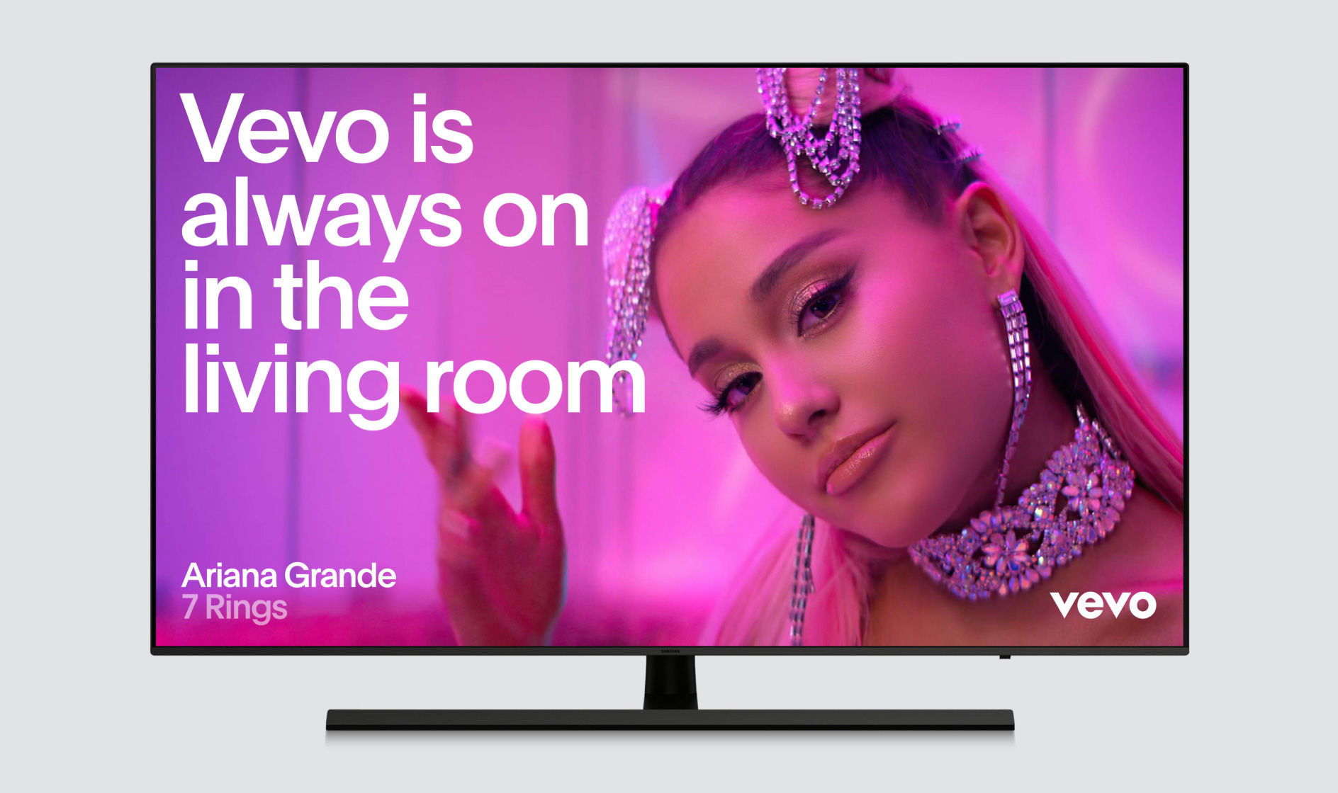
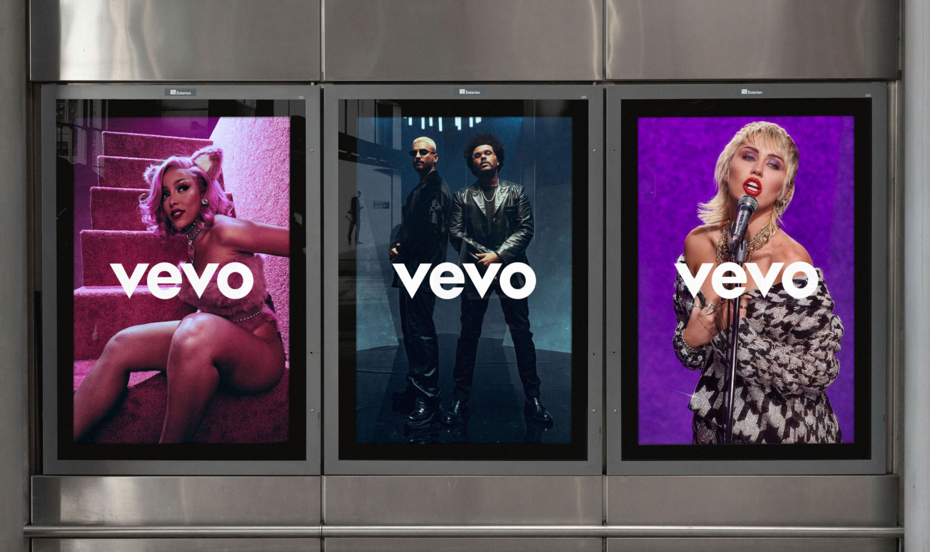
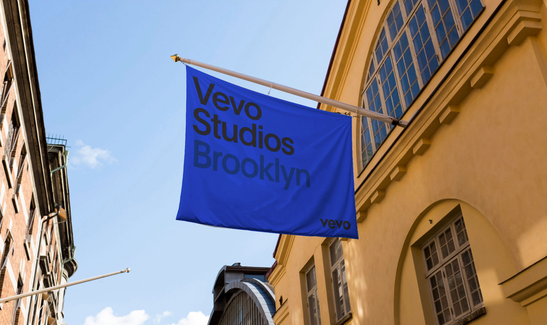
There are five main placement options when it comes to Vevo and partner logos. This offers flexibility when applying logos across various applications.


