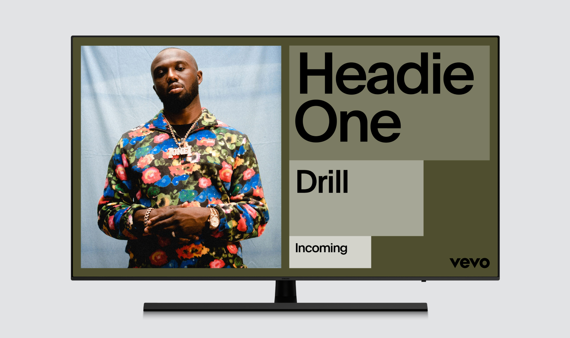
Typography
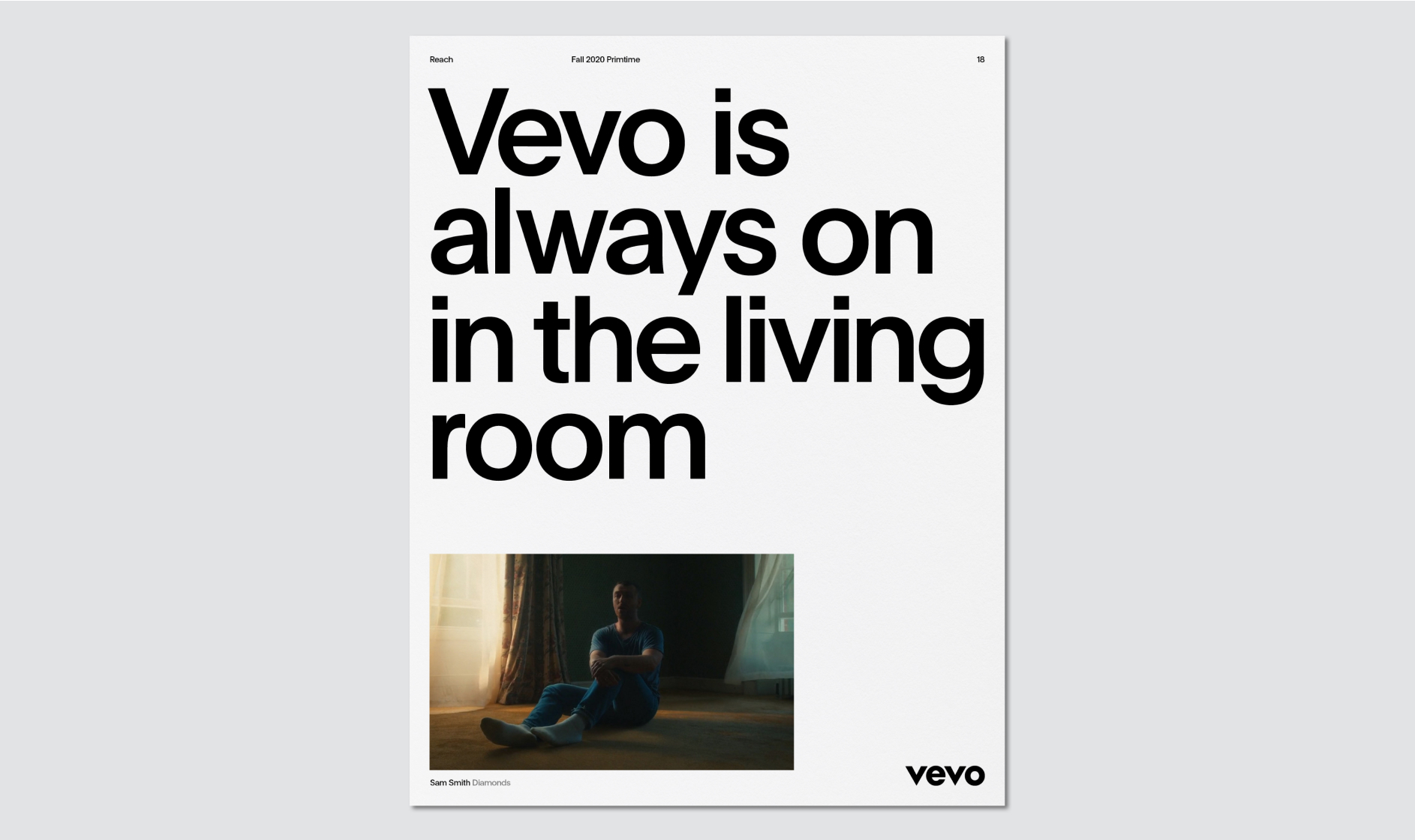
Straight-forward with a polished simplicity, our typography gives all the key information but never talks over the artist. Our typeface is called Plain—in a good way.
Overview
Plain is a radically simple sans-serif font family designed by François Rappo in 2013. It is an incredibly fluid typeface, both flexible and utilitarian at the same time. It complements the geometry of the Vevo logo and provides a warmth that is associated with revivalist Grotesque typeface design.
To obtain a copy of the typeface or if you have questions regarding licensing, please reach out to Vevo Brand Team.
Character Set
Below is an overview of most of the characters in Plain. The typeface supports all European languages except those requiring Greek or Cyrillic characters. For non-Latin alphabets like Arabic, Hebrew, Japanese, etc, the designer or developer should use the closest approximation to Plain available in that language.
Weights
Our brand typeface Plain comes in two weights: Regular and Medium. The most common weight of the typeface used throughout the visual identity is Medium, but we use Regular for small copy to maximise legibility.
Weights
Usage
Below are examples of when different weights of Plain should be used. In general, for any copy above 14px in size, Plain Medium should be used. For anything below 14px, Plain Regular should be used to maximize legibility.
Setting Type
Alignment
Typography should only ever be aligned in two ways: Left-aligned or centered. Never right-align or force-justify typography.
Headline Alignment
Paragraph Alignment
Setting Type
Margins
Our margins are dictated by the logo clearspace, which varies based on the size of the logo. Once the margins have been set, make sure typography is aligned to them.
Setting Type
Case
When setting typography, sentence case should always be used unless working with a tagline or different tiers of information. The examples below set out the rules for capitalizing typography.
Setting Type
Tracking
Tracking is the amount of space given to an entire group of letters in a word. Tracking should be generally tight, but very loose or very tight tracking is to be avoided. Below are some examples to help guide tracking.
Setting Type
Kerning
Kerning refers to the space between each individual letter in a word. Once tracking is set correctly, go into any word and manually adjust the kerning to make sure that the space between the letters feels even throughout.
N.B. Kerning always should be set to Metric.
Setting Type
Wordspacing
Wordspacing is the space between words. It is the final variable of horizontal spacing. Wordspacing must be adjusted to match the tracking and kerning.
Setting Type
Paragraph Leading
Leading is the space between lines. The visual effect of leading should always be optically greater than the wordspacing, which should always be optically greater than the tracking. This will prevent words from being read out of order and keep the eye from jumping around the page.
Setting Type
Headline Leading
Headline leading should be generally tight, but very loose or very tight leading should be avoided. The headline below is set at 135/120. As long as the ascenders and descenders don’t crash, this is a desired leading. In most instances, 135/135 is acceptable and ensures a safe amount of leading.
Setting Type
Examples
Below are examples of kerning, tracking and leading all working together. Notice how the bigger the type is, the tighter the tracking and leading becomes relative to type size. These elements become looser with smaller type to maximise legibility.
Setting Type
Don’ts
There will undoubtedly be occasions where a type problem arises that isn’t addressed in this toolkit. In these cases, refer to the guidelines as much as possible and try to find a solution that feels consistent with the overall brand. Below are some things that should always be avoided when setting type.
Type Hierarchy
Scale
In order to keep things simple, no more than three type sizes should be used in one communication piece. These sizes follow a simple formula: each type size should aim to be a minimum of 50% larger than the preceding type size.
Type Hierarchy
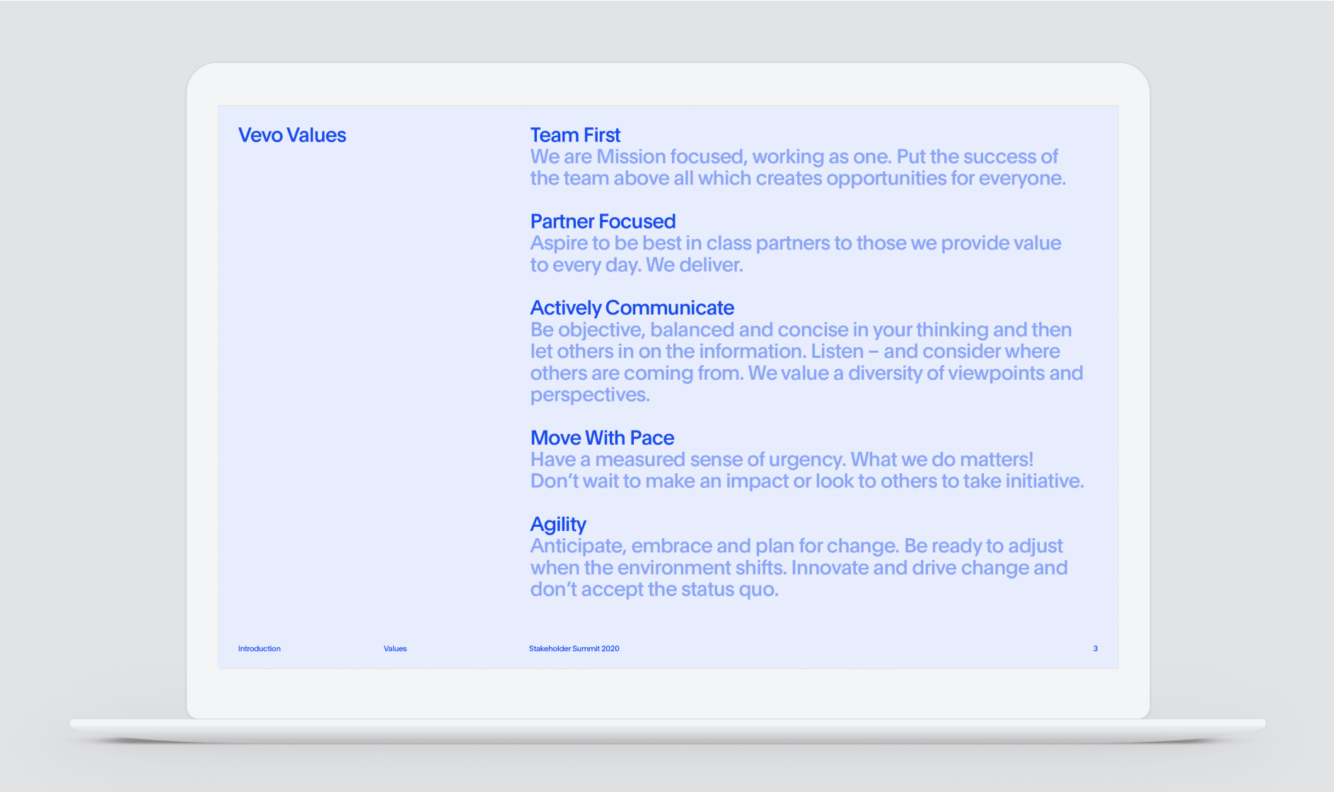
Secondary Tones
Our secondary tones provide an additional opportunity to create hierarchy within compositions. By shifting the tone from line to line, we can control the order in which the information is read.
The above example shows an incorrect use of our secondary tones, where they do not fall incrementally. This causes problems and means the information isn’t read in the intended order.
Type Hierarchy
Blocks
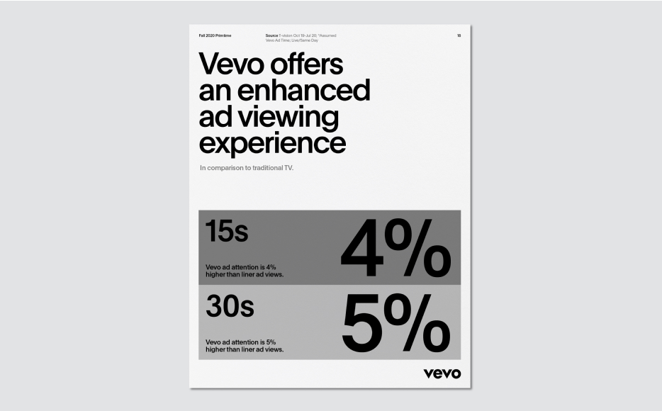
Our graphic blocks can also create hierarchy through scale. When adding typography to the blocks, always ensure the type size in any given block is larger than the one before it.

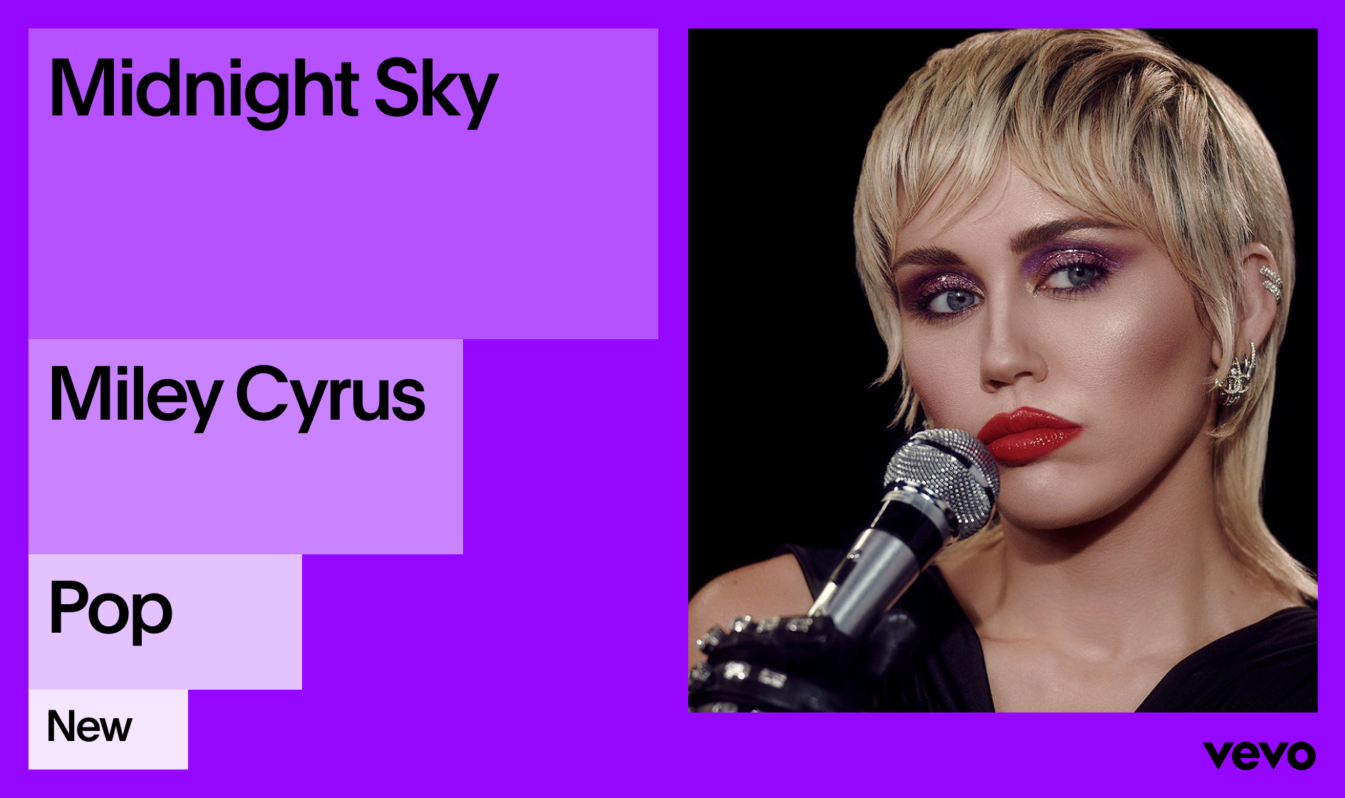
This example may seem similar to the previous one, but the key difference is that the type sizes are too similar to each other. Always ensure there is a visible difference in size to ensure the hierarchy is effective.

While it may be tempting to size typography so that it stretches the width of the block, this can cause problems if the line lengths are different. Instead, always focus on making the type size noticeably larger than the type size of the previous block.
Type On Image
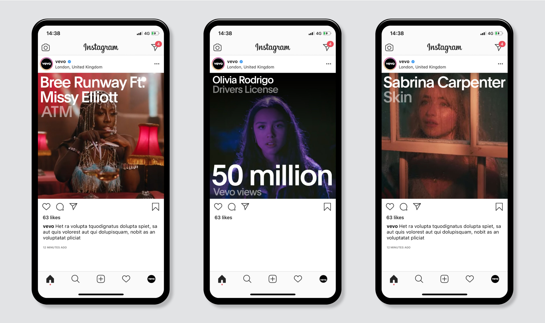
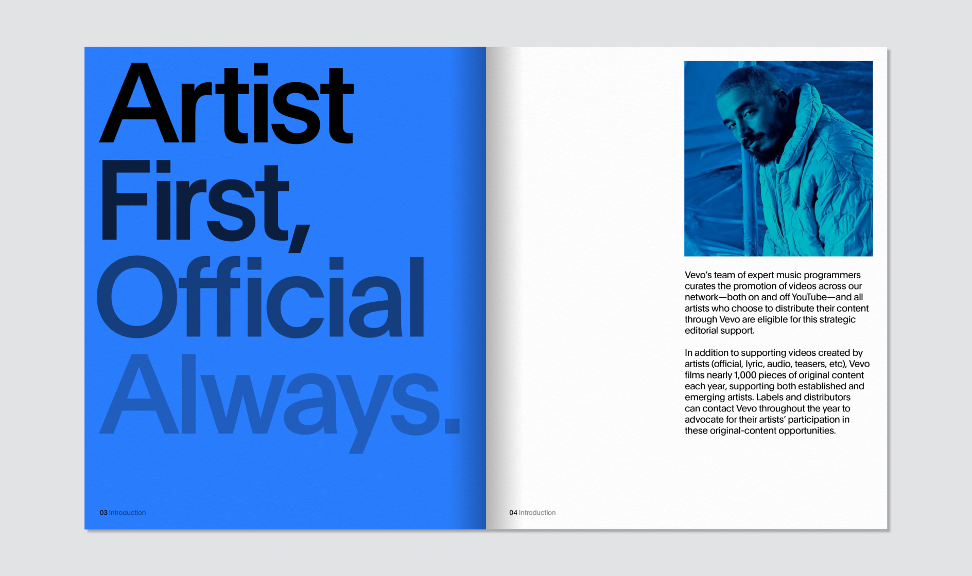
Typography can also be applied on top of imagery. In these instances, use black typography on lighter images, and white typography on darker images to ensure that there is enough contrast. Never use color typography on imagery.
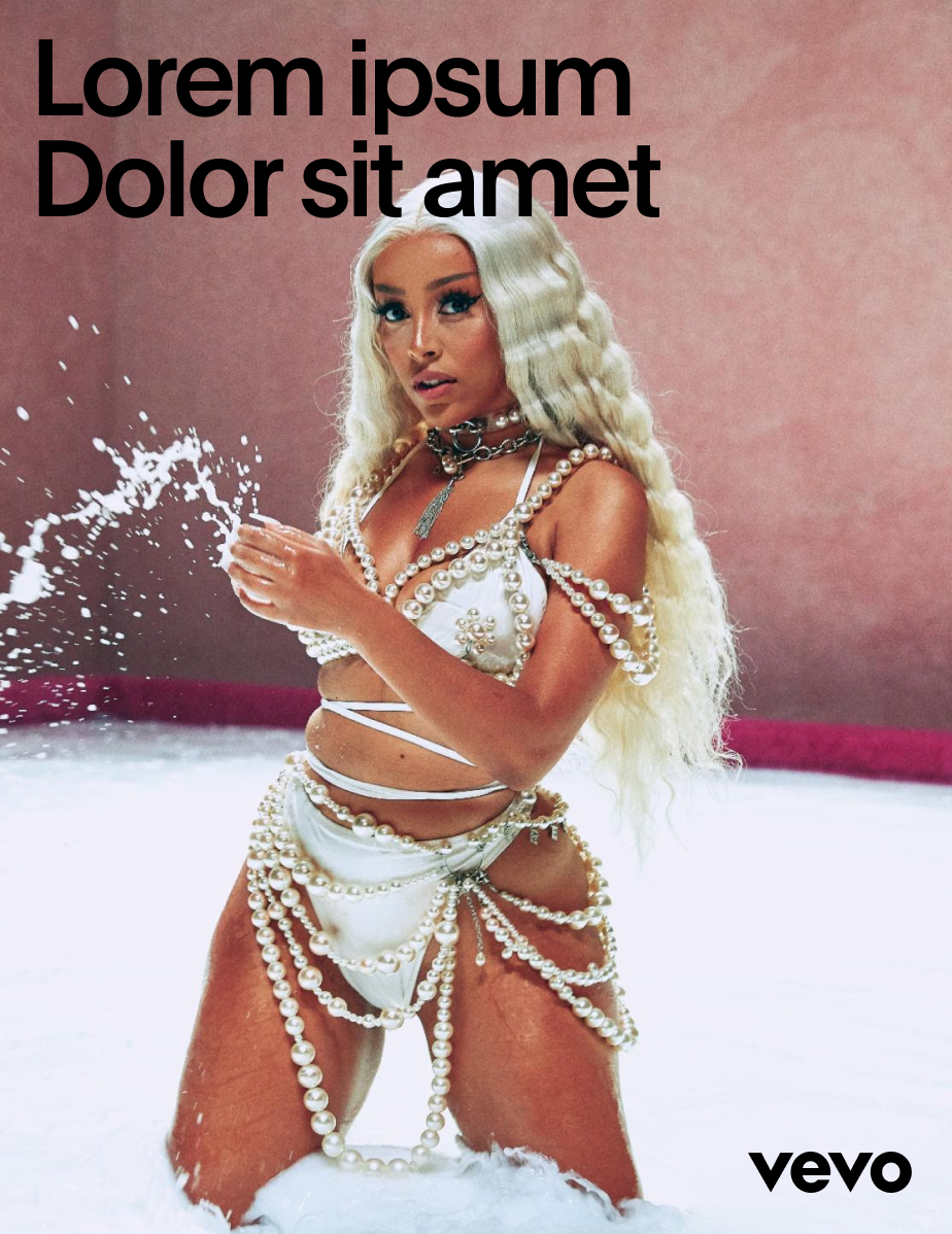
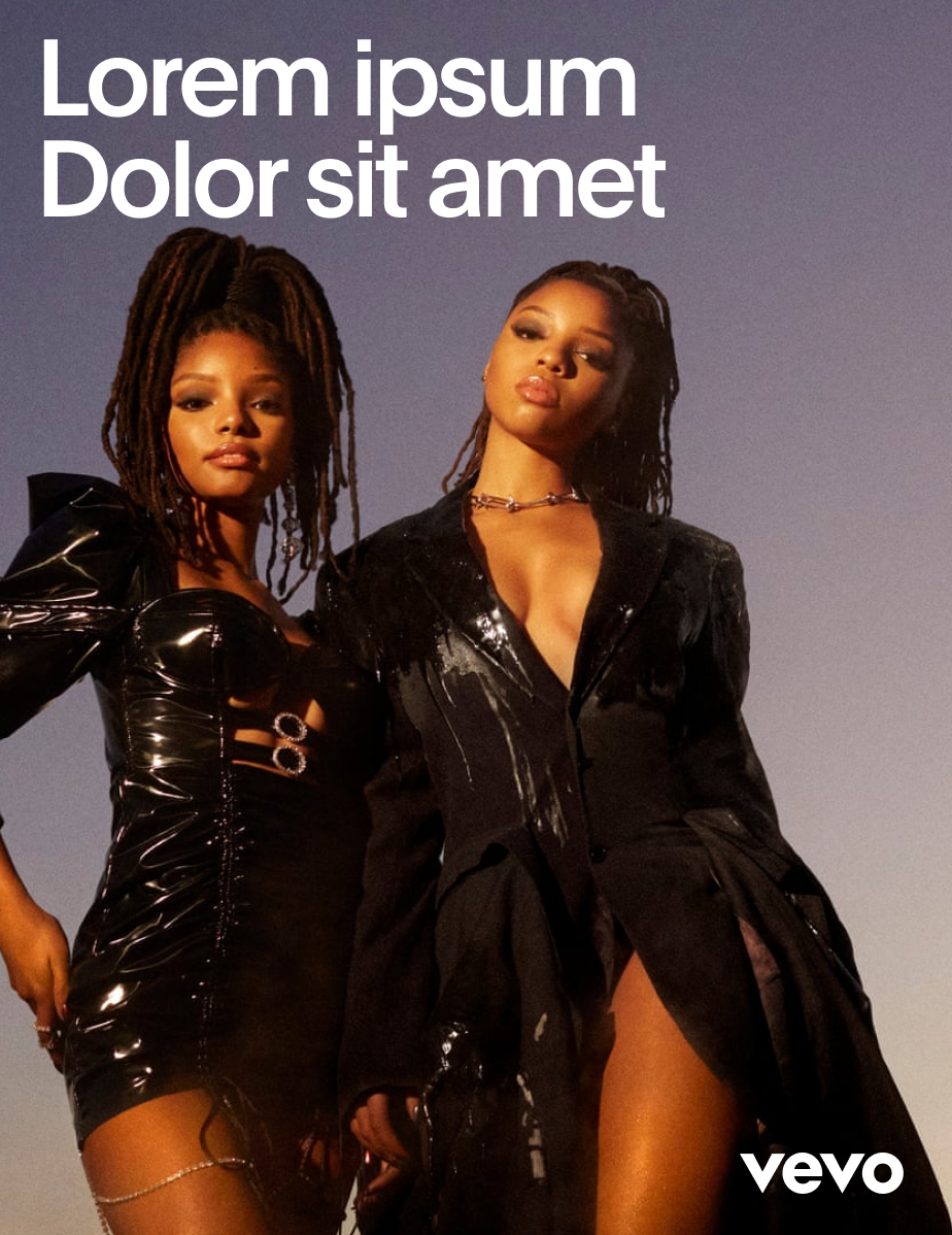
Application Examples



Plain Medium
Dolor sit amet
Consectetur
Plain Medium
Plain Medium
Plain Regular
Tracking -9%

Tracking -3%

Tracking -6%


80/100/133

65/85/100

Leading 22/25

Leading 22/31

Leading 22/27

a screen near you


